Product Designer · BaselOpen for design roles

I love bringing clarity to systems and courage to visuals.

Header: title top left in Black weight; menu at H1 size, transparent, hides on scroll down and returns on scroll up. On mobile the menu sits at the bottom for the thumb.

Listening to people’s stories before designing.

Pairs (D): product left, visual right, one sentence that links them. Each half opens its own page.

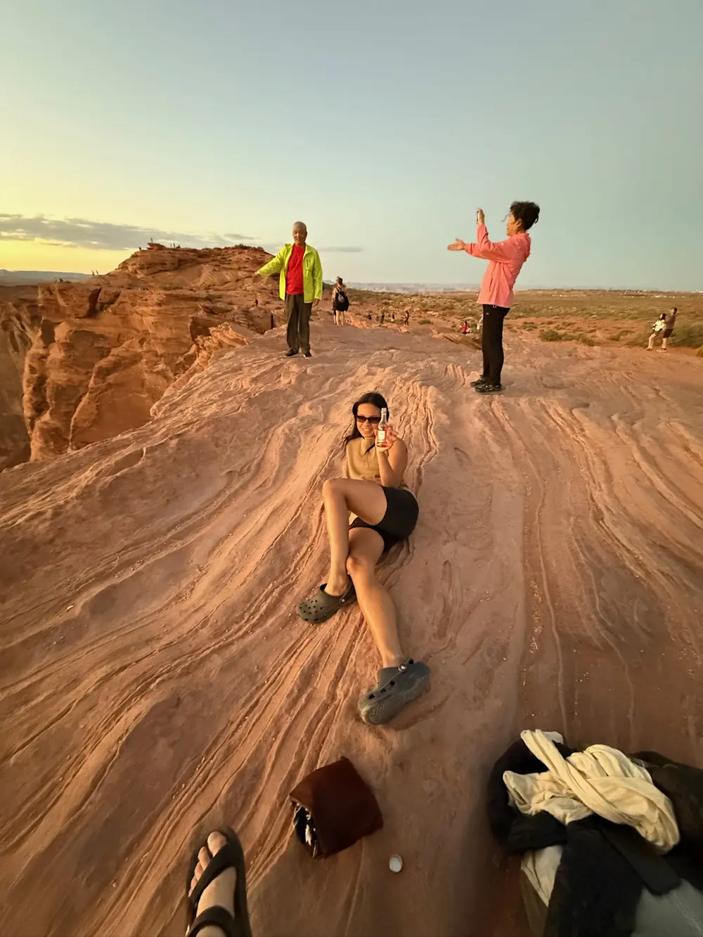
Gaby Luong relaxing on red sandstone at sunset, raising a small bottle

I’m a product designer from Basel. I build calm, functional systems that make complex products clear and easy to trust.

I studied Visual Communication with a focus on typography. After graduating in 2015, I moved to London and worked for the creative agency SPIN and for Victoria Beckham. I had always been drawn to Dutch culture, so I moved on to Amsterdam for four years, working mostly for my own clients. Running my own practice taught me to roll up my sleeves. I like to get into the details myself, and I do my best work in a team.

To me, good design is like a forest. Once you’re in it, everything feels natural: people find their way, and no one notices how much is at work around them. That’s the kind of forest I want to help companies grow.

Away from the screen, you’ll find me hiking, training BJJ, enjoying good food or tracking down good architecture.

Let’s talk, about a project, over a coffee or a game of chess.

About text refined: short paragraphs, one idea each.

Landing · All

UX Research, Design Systems & UI Design

Case studies from research to launch, mostly in scientific publishing.

Unified design system for MDPI

Eight initiatives, one visual language, built from MDPI’s own science.

Brand/System Designer · 2020–2024

Read My Case Study →
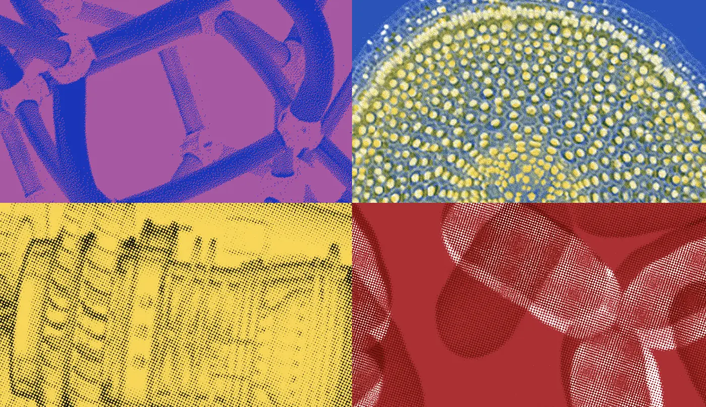
MDPI design system across web, mobile and print

MDPI Books: publishing platform redesign

Open access books that are easier to find and easier to publish.

Product Designer · 2023–2024

Read My Case Study →
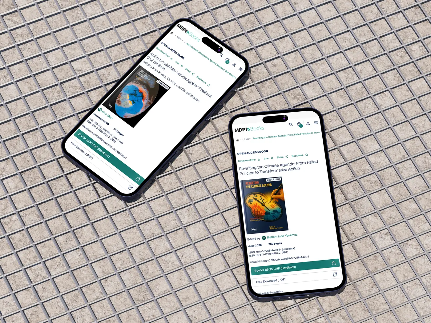
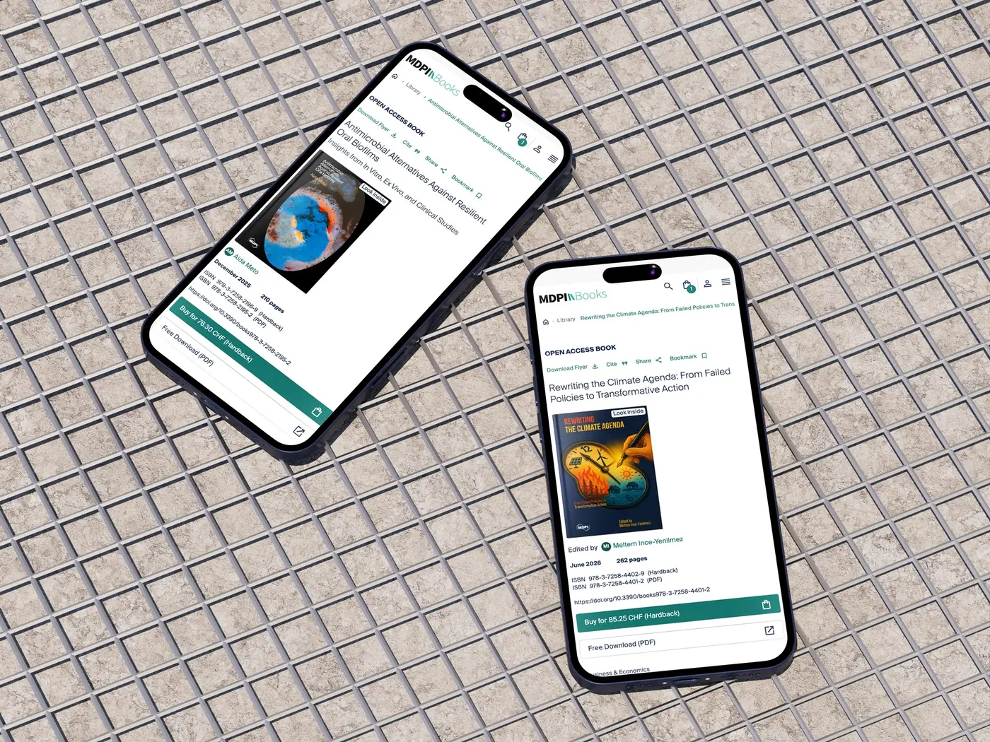
Redesigned MDPI Books pages on mobile

MDPI User Hub: UX research

Why satisfied users still left right after login.

Lead UX Research · 2025

Read My Case Study →
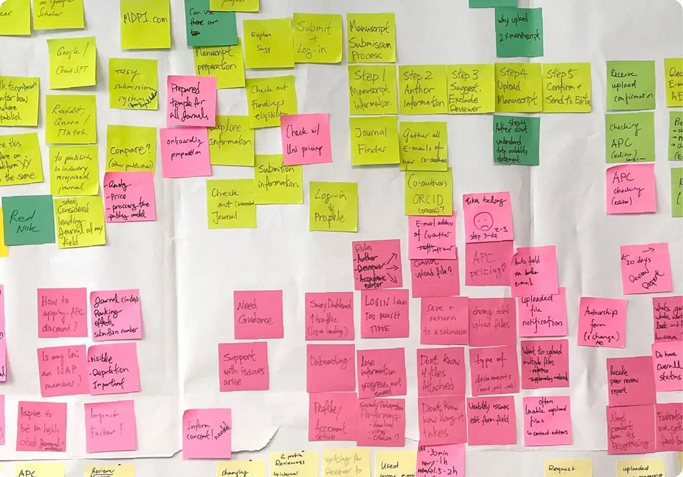
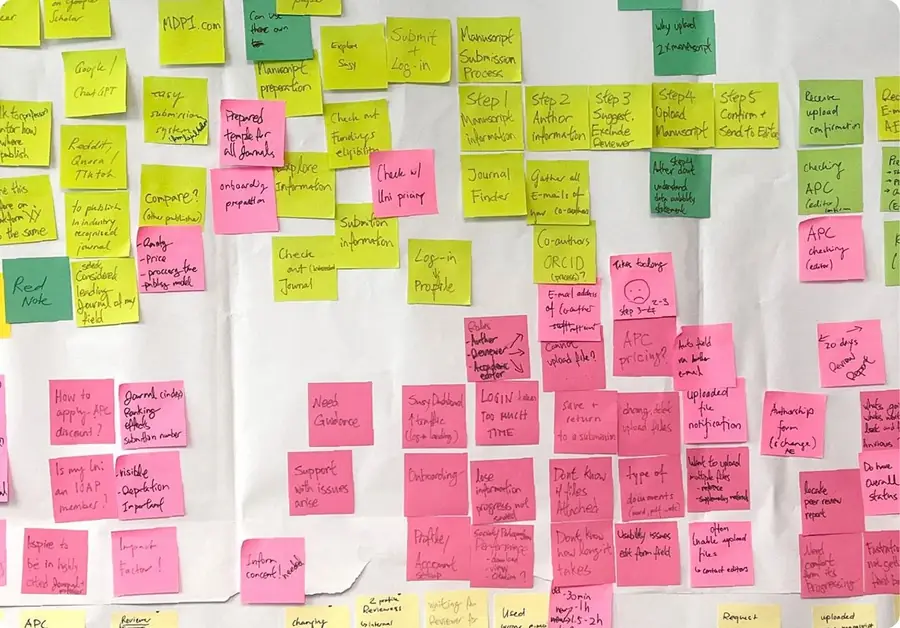
Affinity map with sticky notes from the User Hub interviews

Altstadt Bern: UX research beyond the screen

Why people walk through Bern’s lower Old Town without stopping.

UX Researcher · 2025

Read My Case Study →
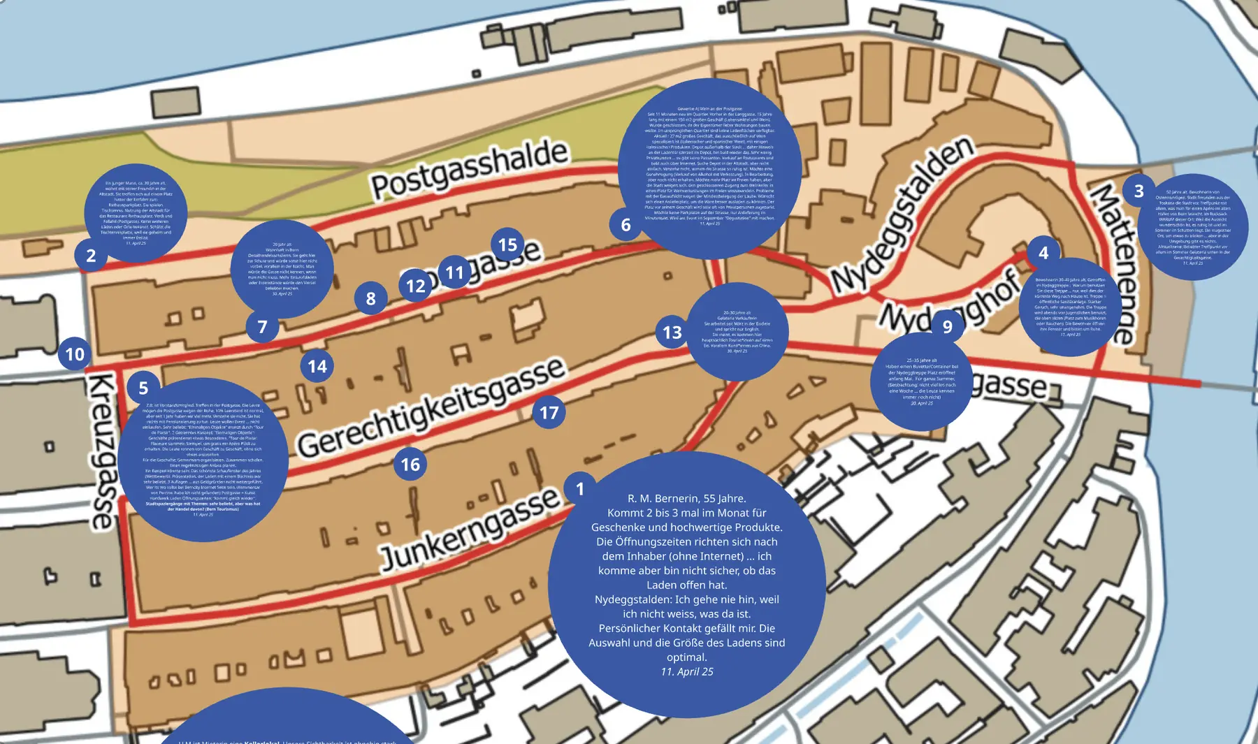
Map of Bern’s lower Old Town with research notes
Product · single line

Identity, Typography, Print & Motion Design

Selected work, most of it from my years as an independent designer in London and Amsterdam.

Shanghai Biennale

An identity built from the biennale’s own typeface, from catalogue to museum facade.

Art Director & Graphic Designer · 2018

Tell Me More →
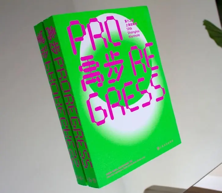
Shanghai Biennale 2018 catalogue cover in green and magenta
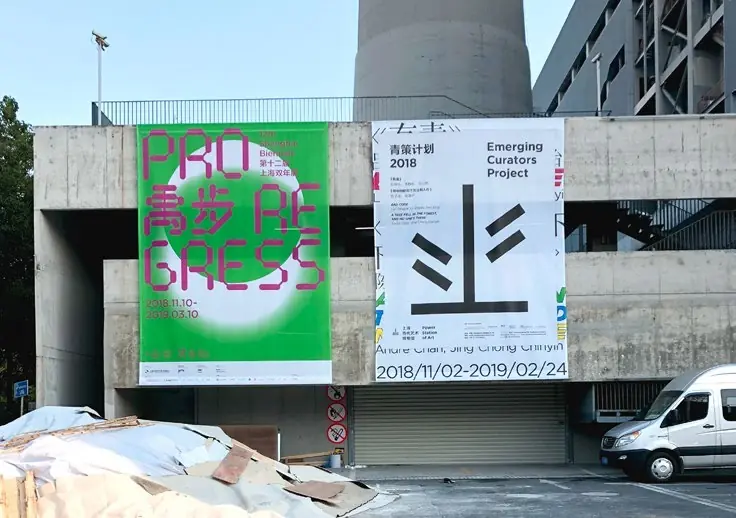
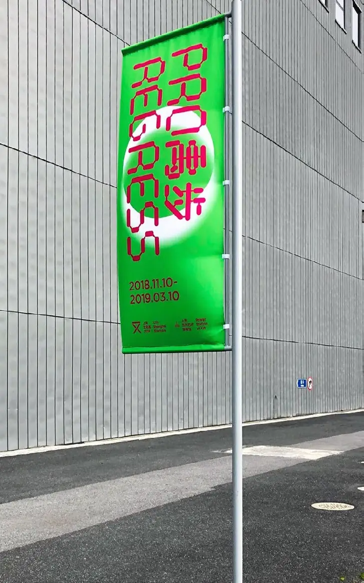
Shanghai Biennale street banner outside the museum
Biennale banners at the entrance of Power Station of Art
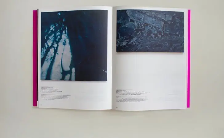
Catalogue spread with artwork photography
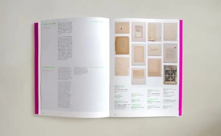
Catalogue spread with archive images and texts

Living Matters

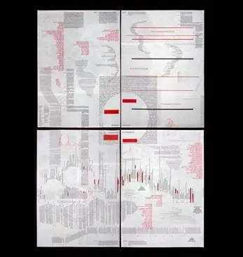
Scientific imagery turned into a typographic system on thin riso paper.

Graphic Designer · 2020–2021

Tell Me More →
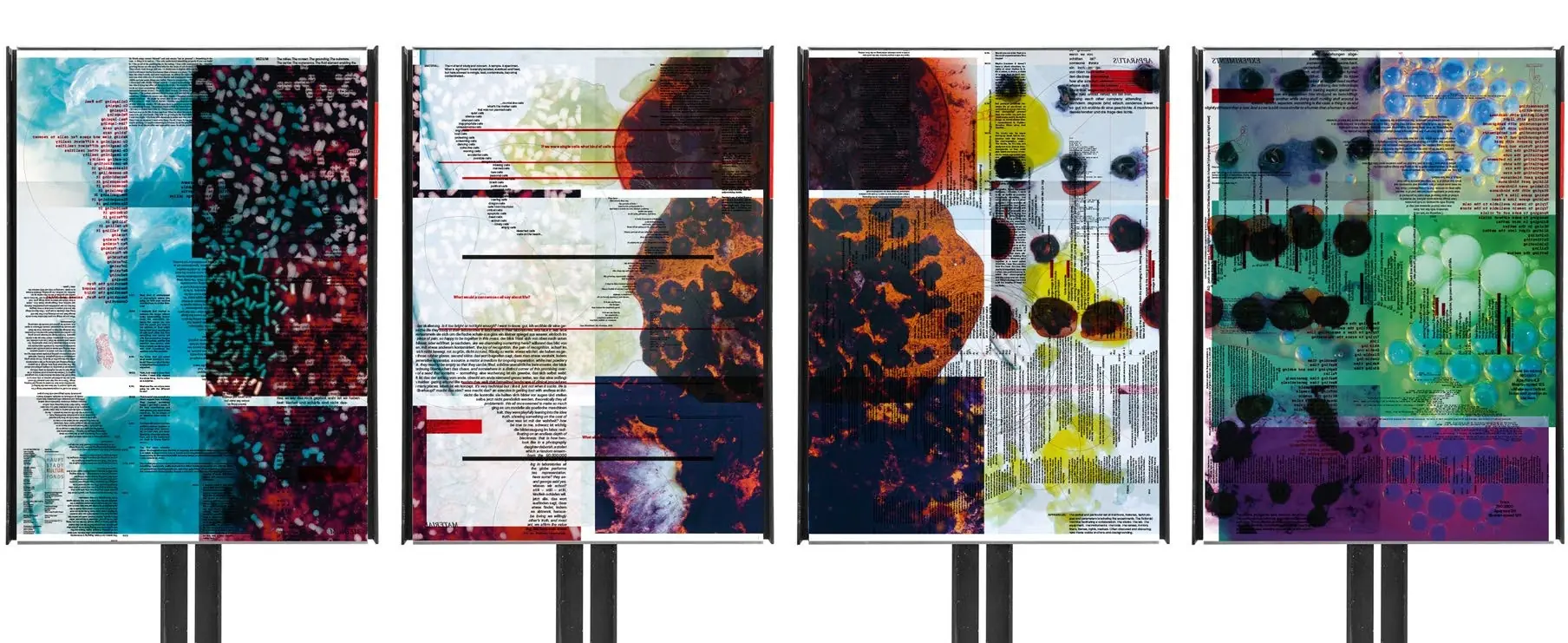
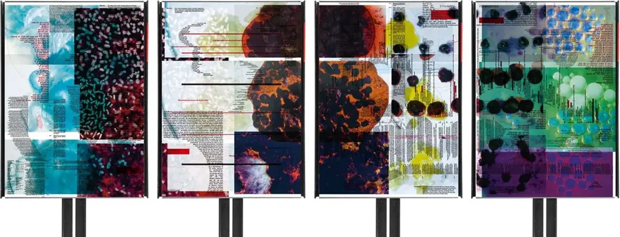
Four Living Matters risograph posters on stands

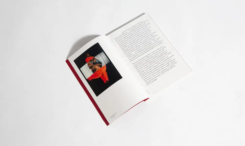
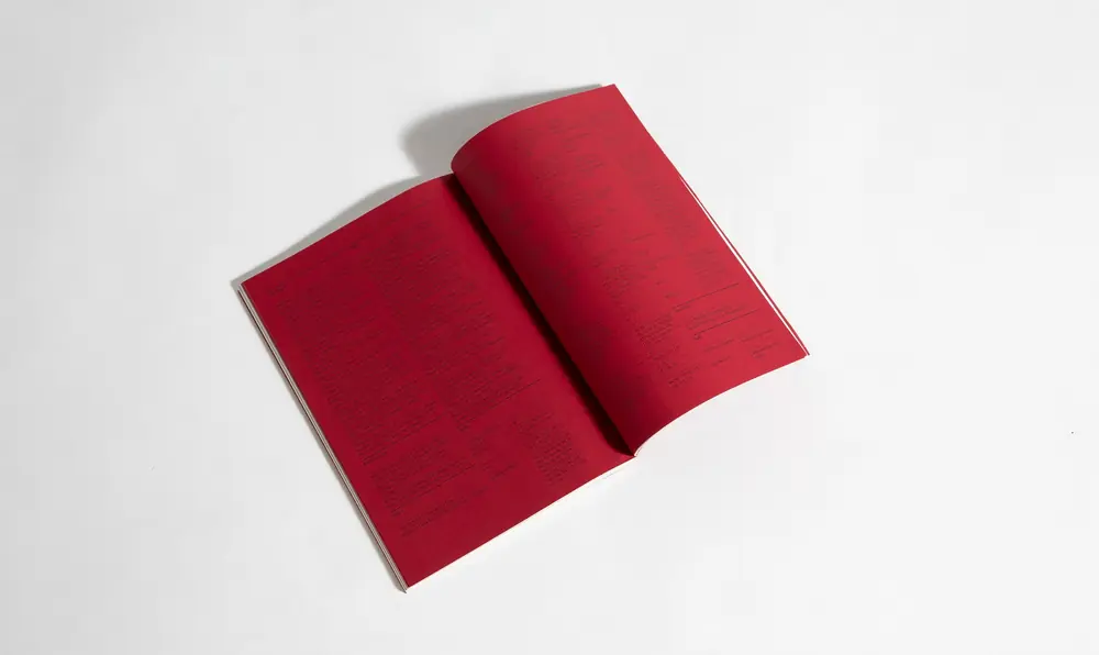
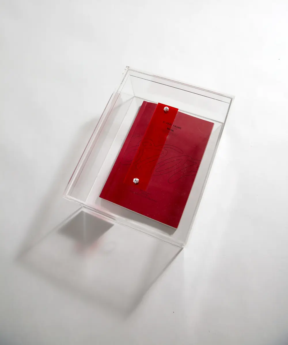
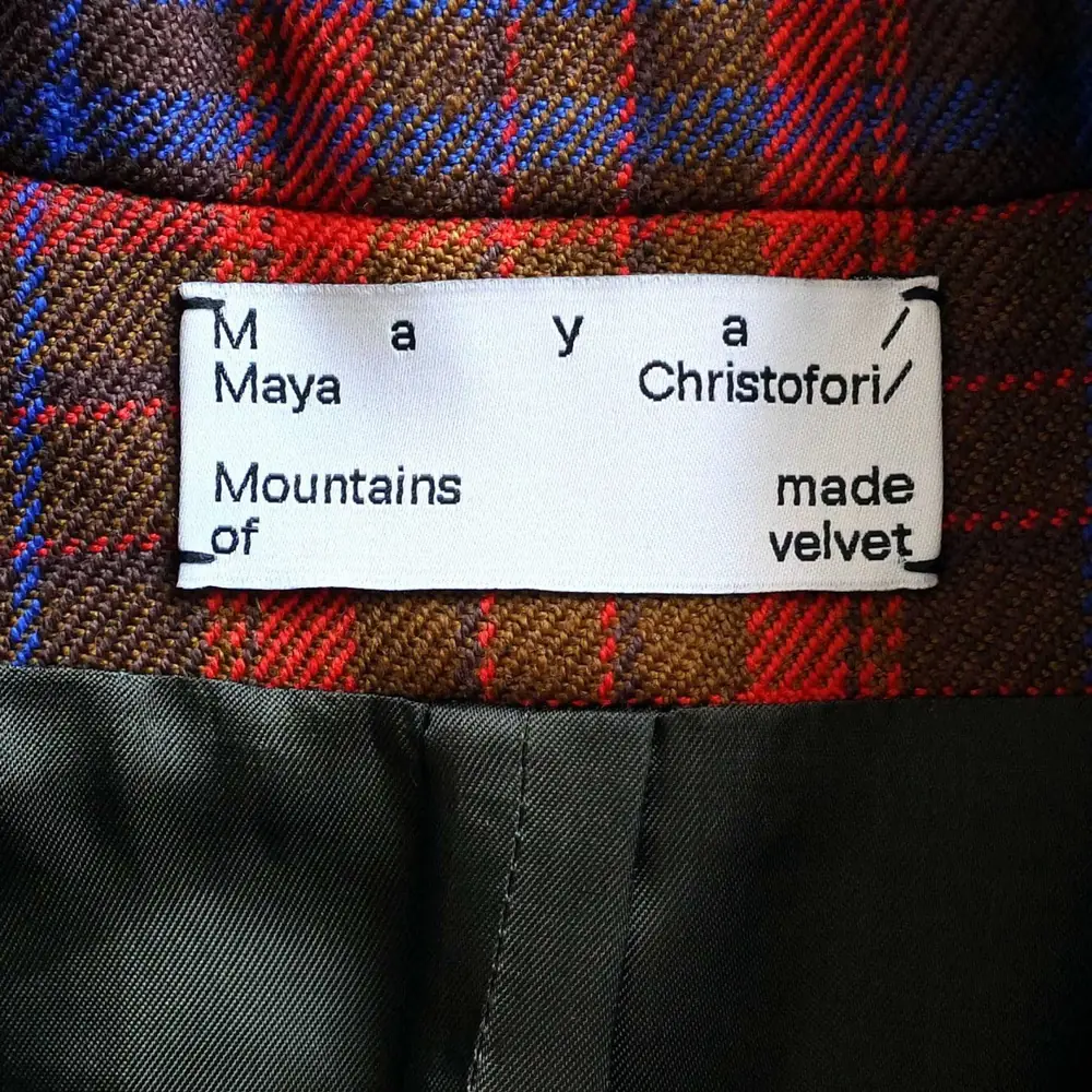
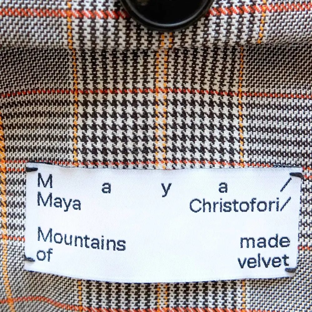
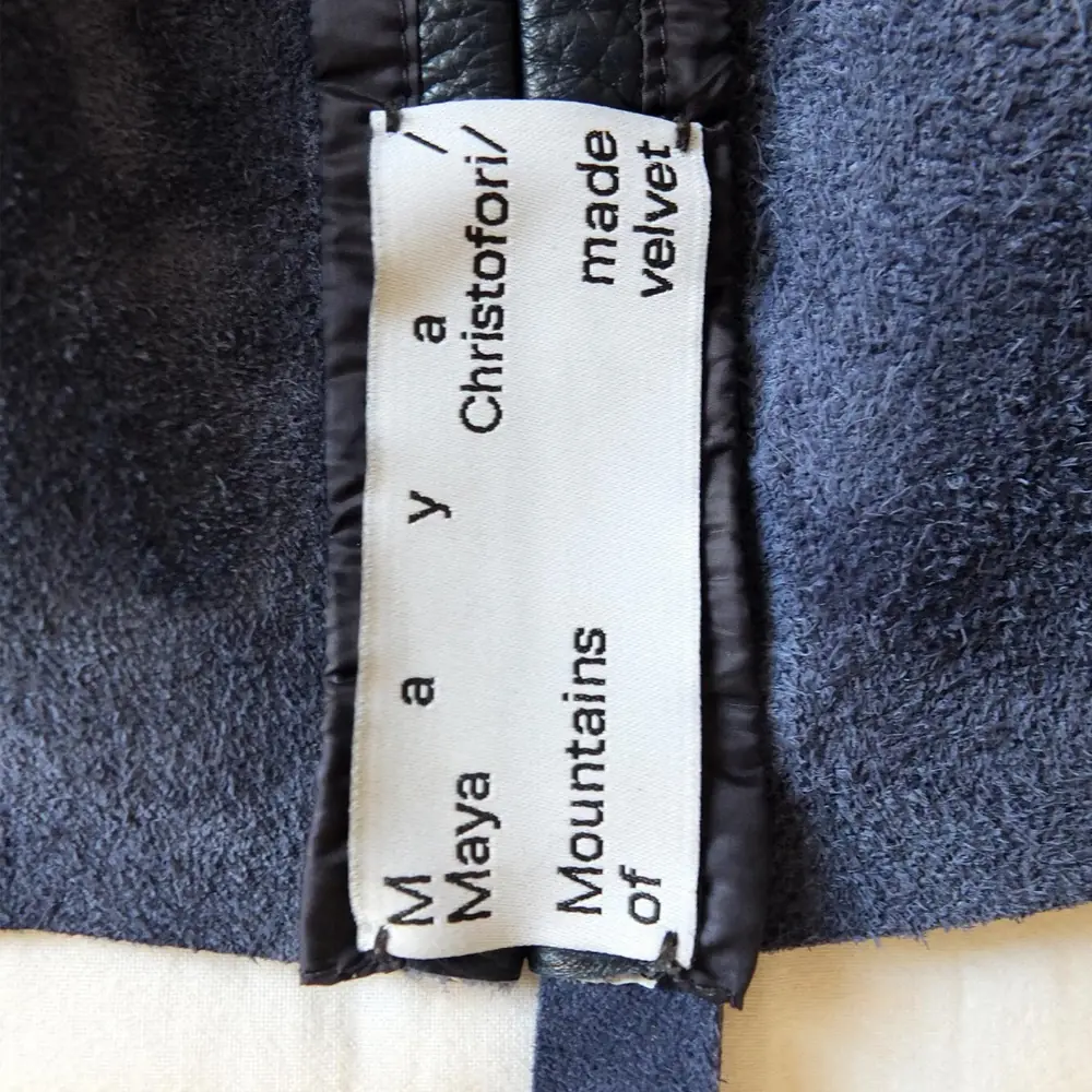
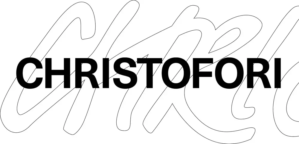
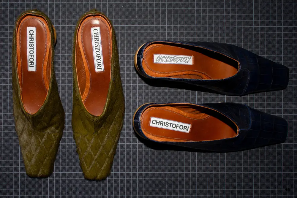
Christofori

Identity, book and packaging for a fashion label, down to the woven label.

Identity · Book · Packaging · 2020–2022
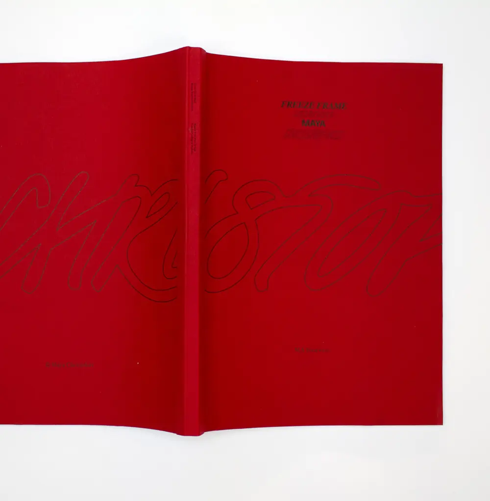
Red Christofori book cover
Open Christofori book with a photograph
Christofori book on red endpapers
Acrylic Christofori shoebox with the red book
Christofori label in a checked jacket lining
Christofori label on houndstooth fabric
Vertical Christofori label on blue velvet
Christofori wordmark over an outlined script
Christofori shoes with logo on orange insoles

MAMA

Film titles that move between control and vulnerability, like the film.

Art Director · 2022

Tell Me More →

Collect at Saatchi Gallery

Identity and wayfinding for an international craft fair in London.

Designer at SPIN · 2016–2017
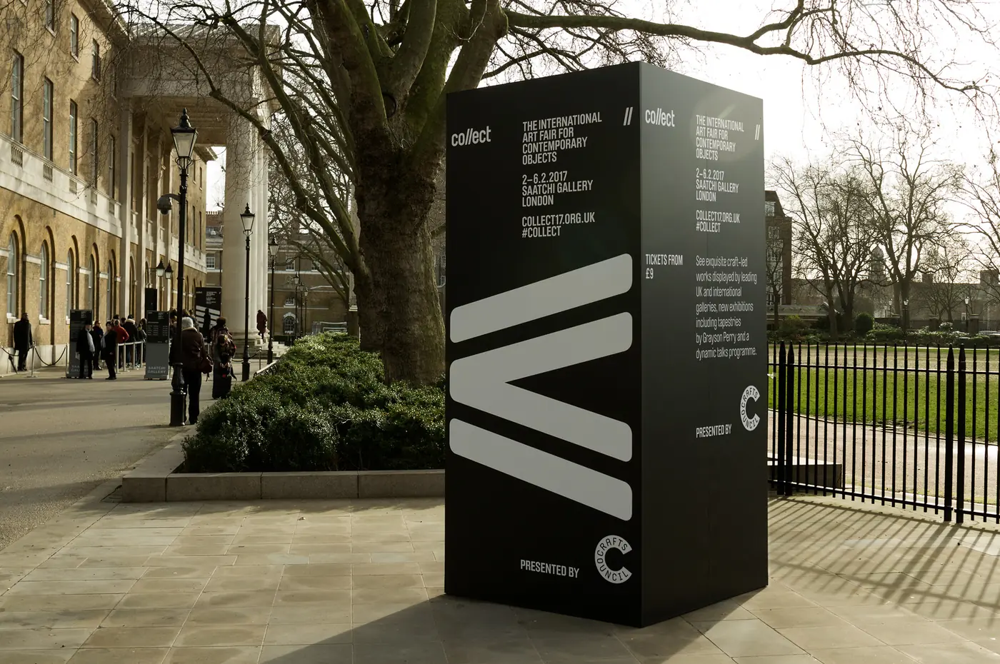
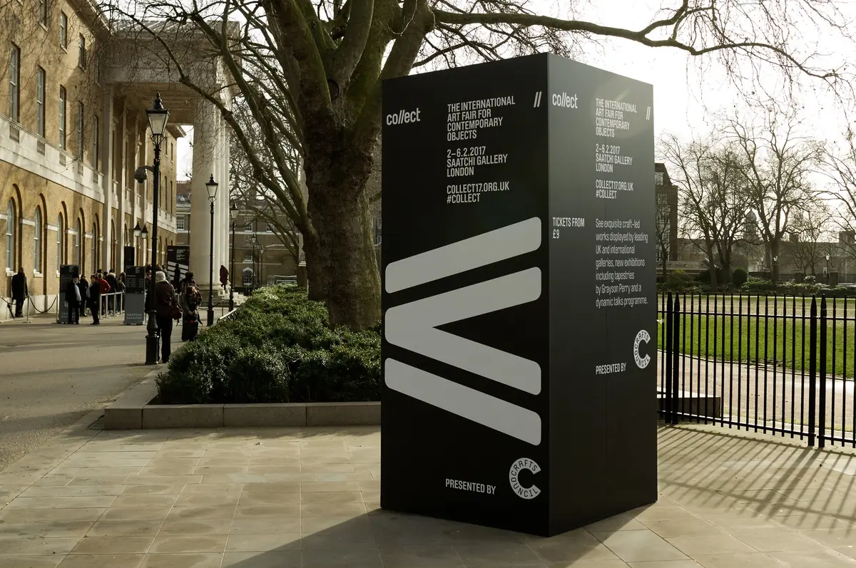
Collect totem with large chevron graphics outside the Saatchi Gallery
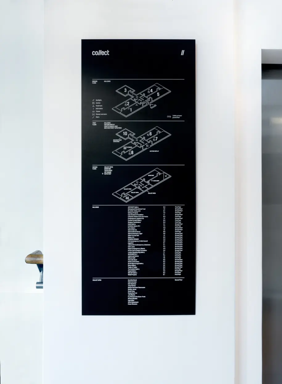
Collect floor directory sign on a white gallery wall
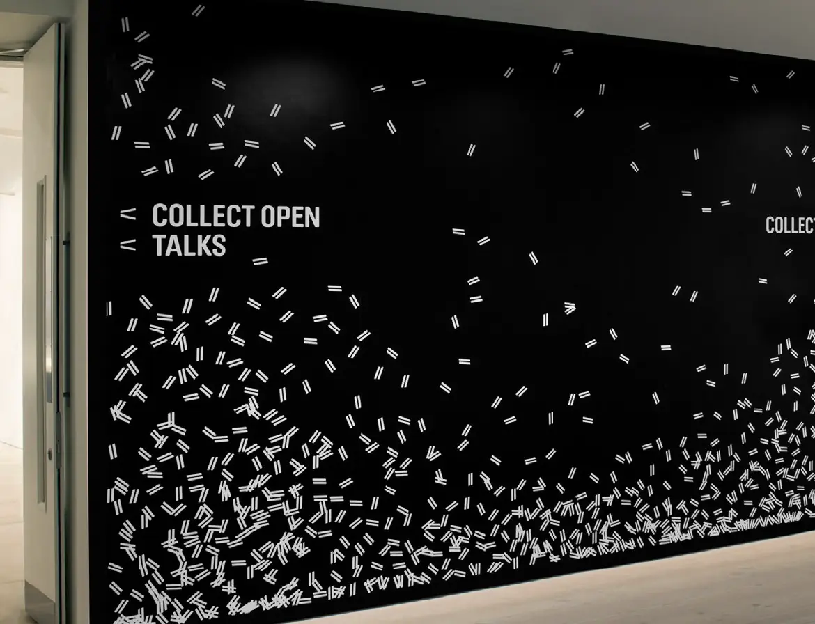
Collect Open Talks wall with scattered chevron pattern
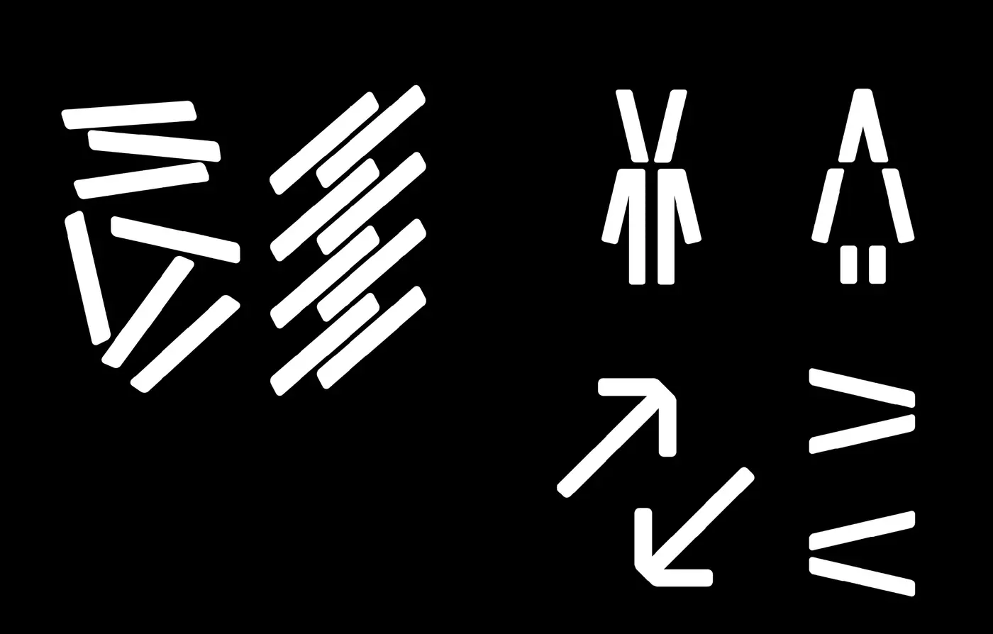
Collect wayfinding pictograms and arrows in white on black
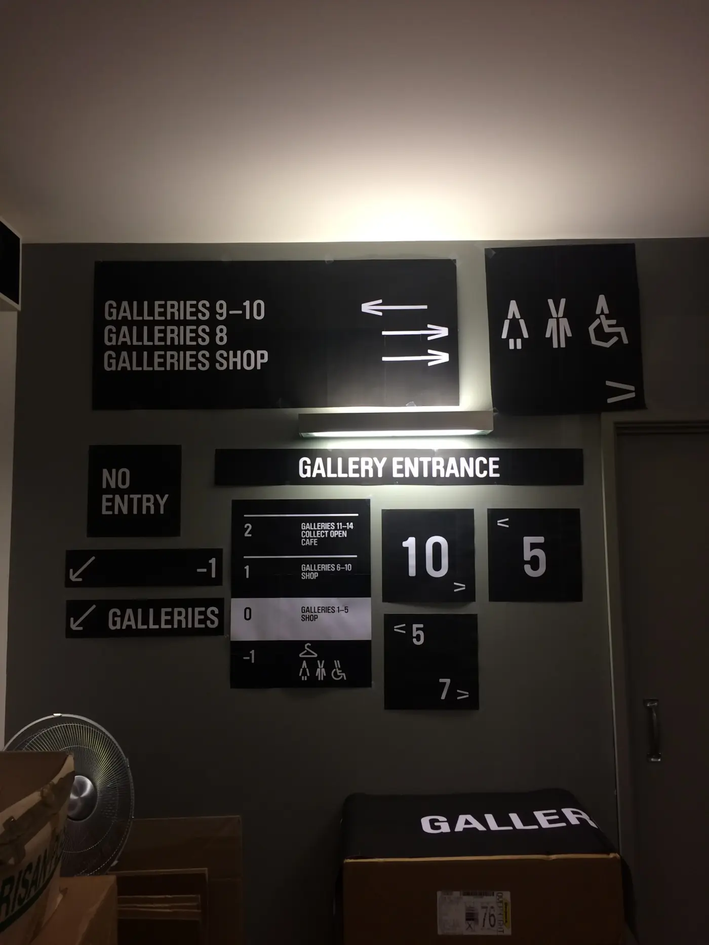
Collect directional signs for galleries, toilets and entrance
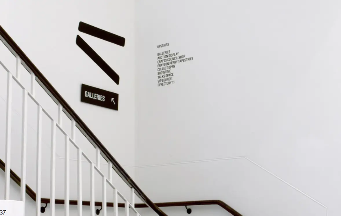
Collect chevron graphics and gallery sign along a staircase
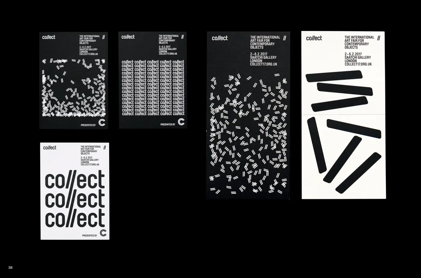
Collect poster series in black and white
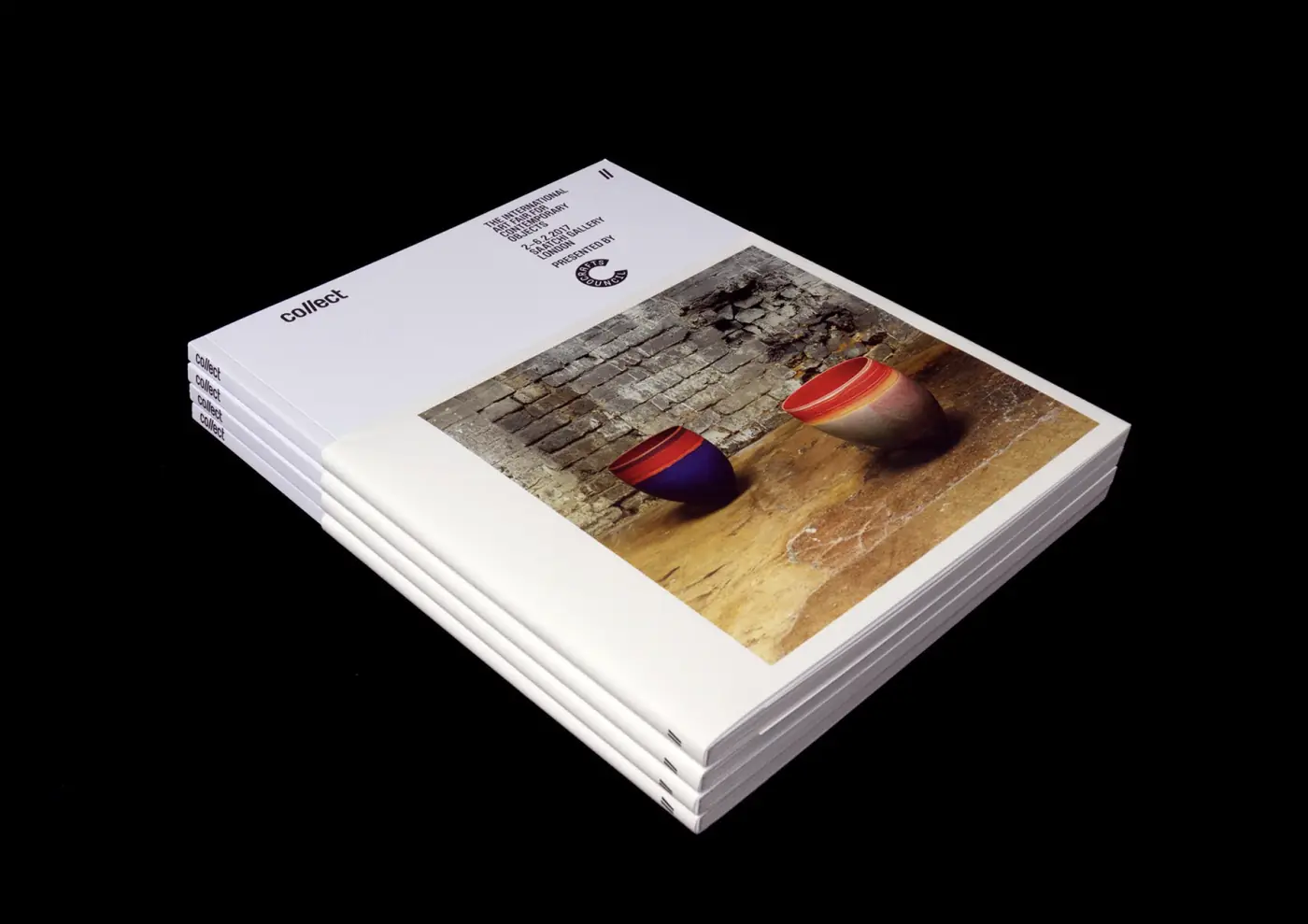
Stack of Collect catalogues with a ceramics cover
Collect exhibition: grid of printed object photographs on the floor

BBC Reith

Posters introducing the BBC’s own typeface.

Typography · Poster · 2017
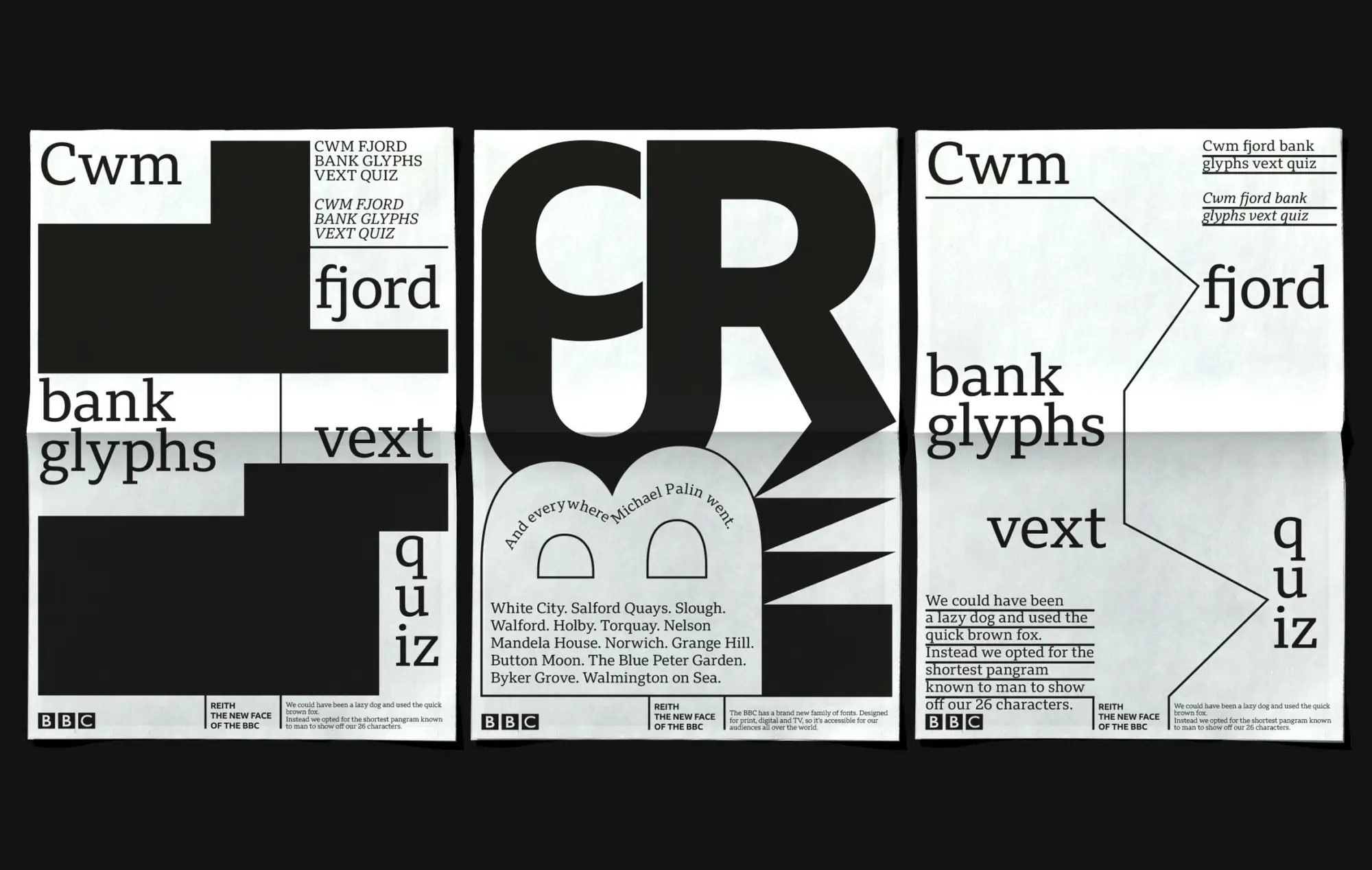
Three BBC Reith typeface posters on black

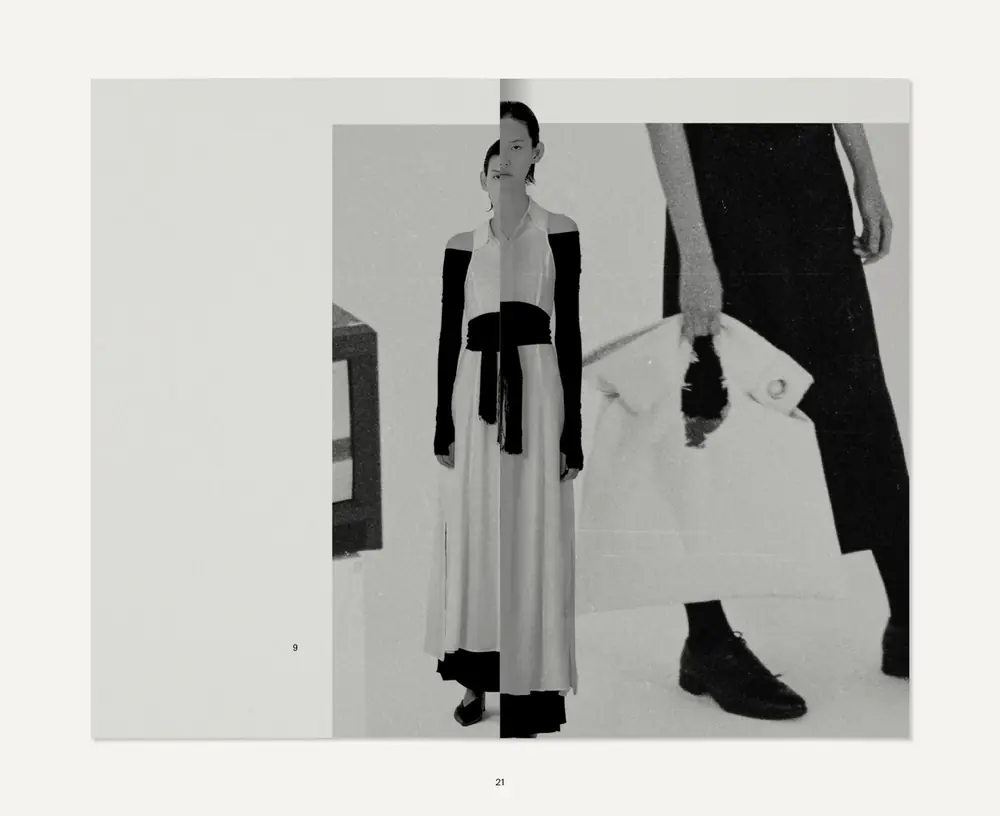
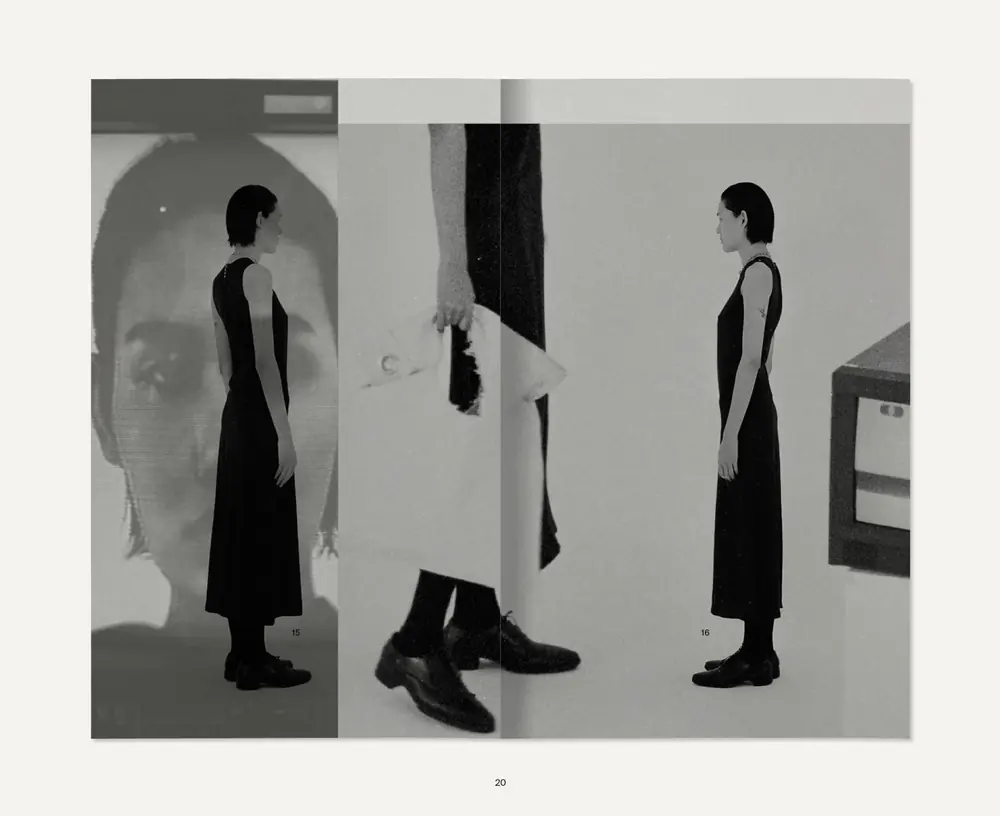
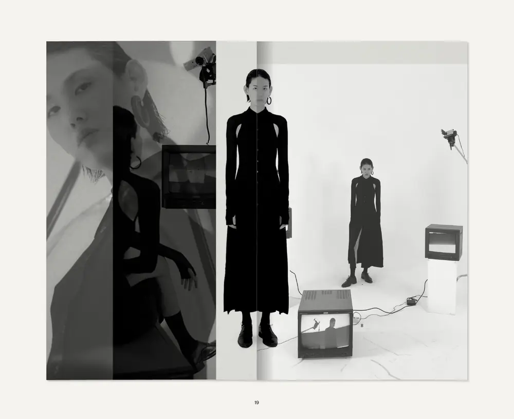
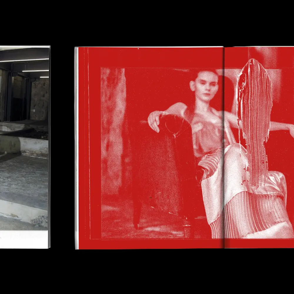
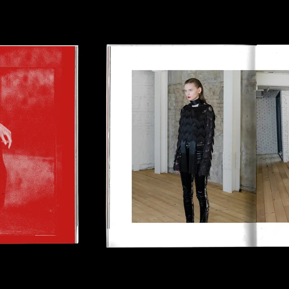
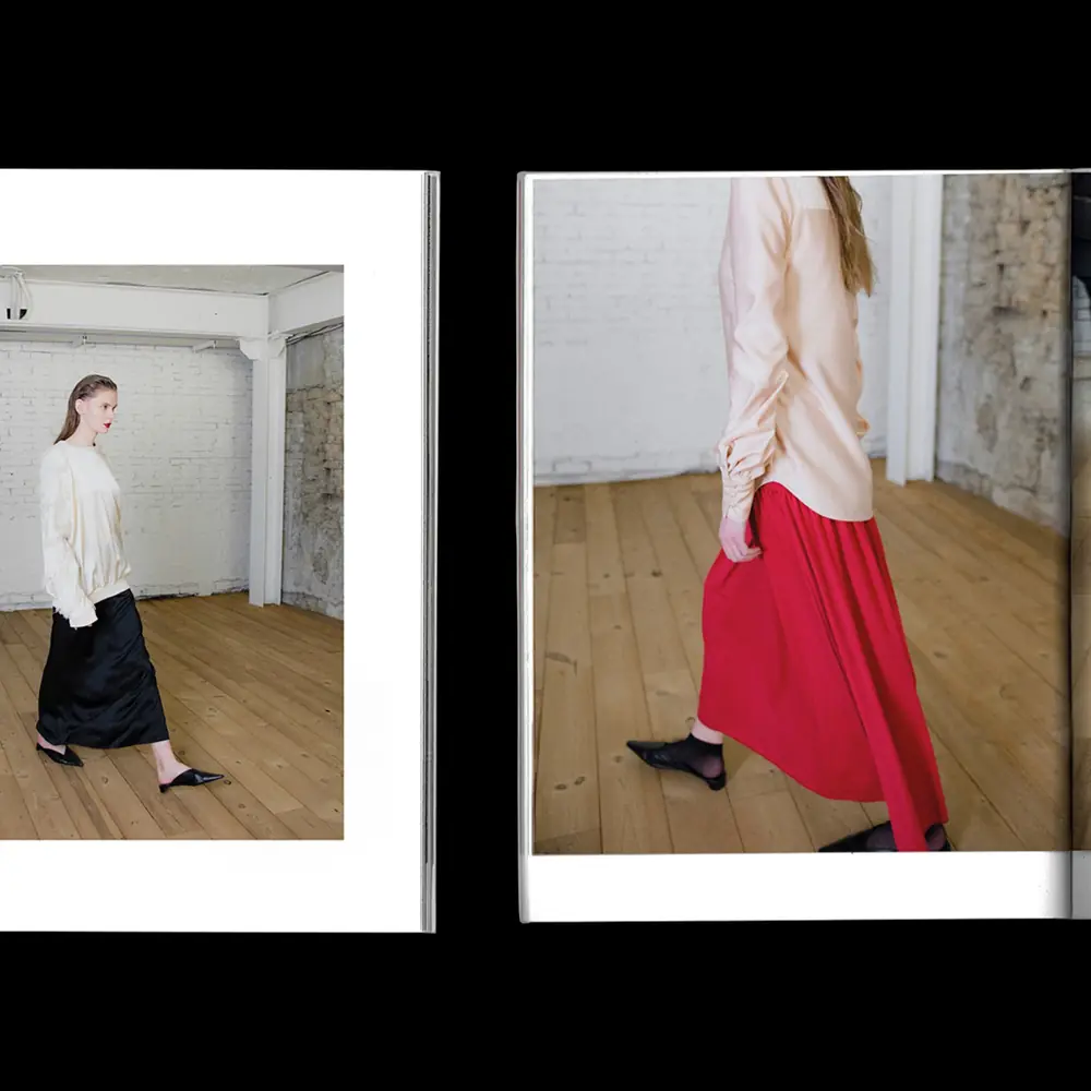
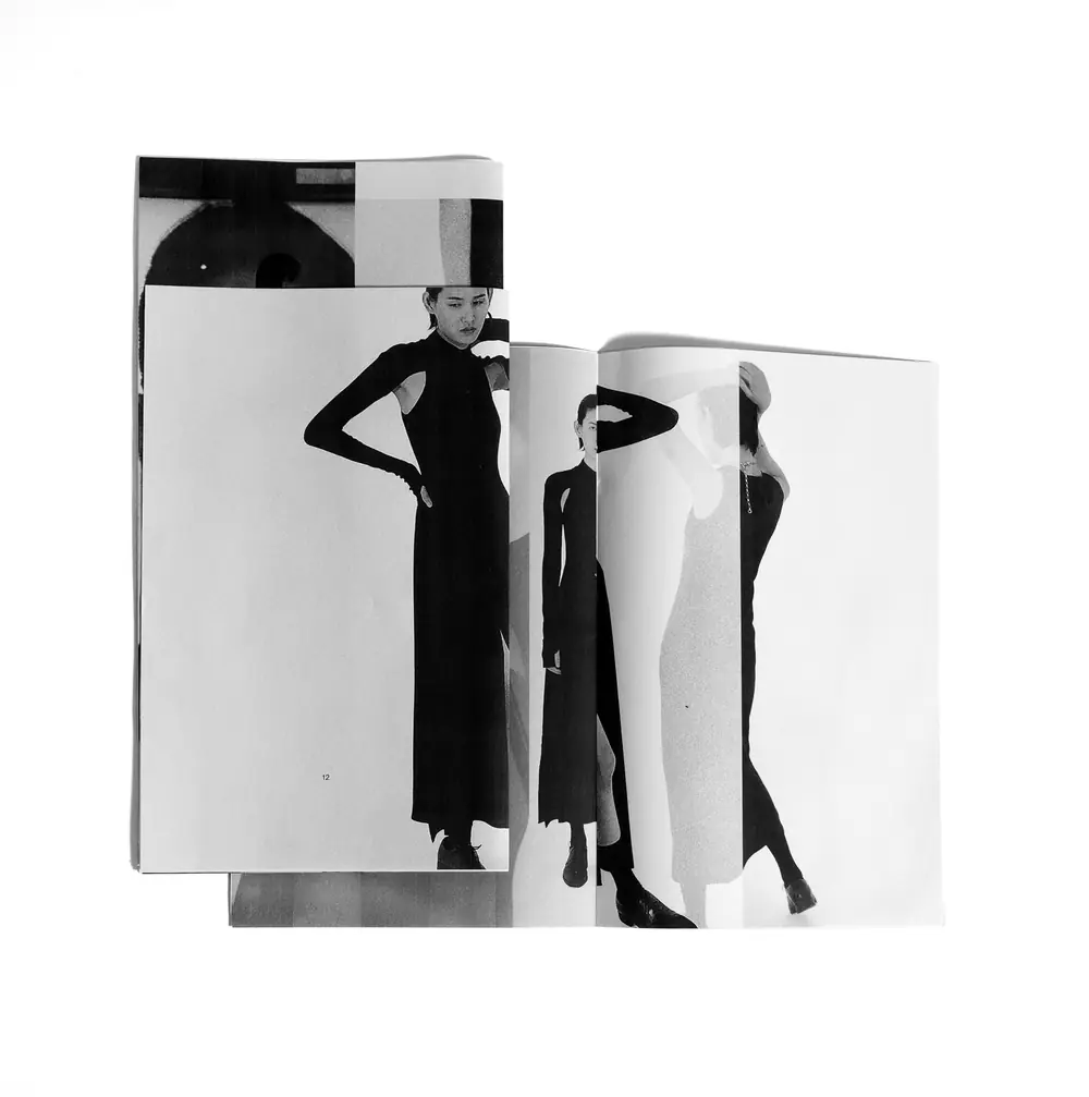
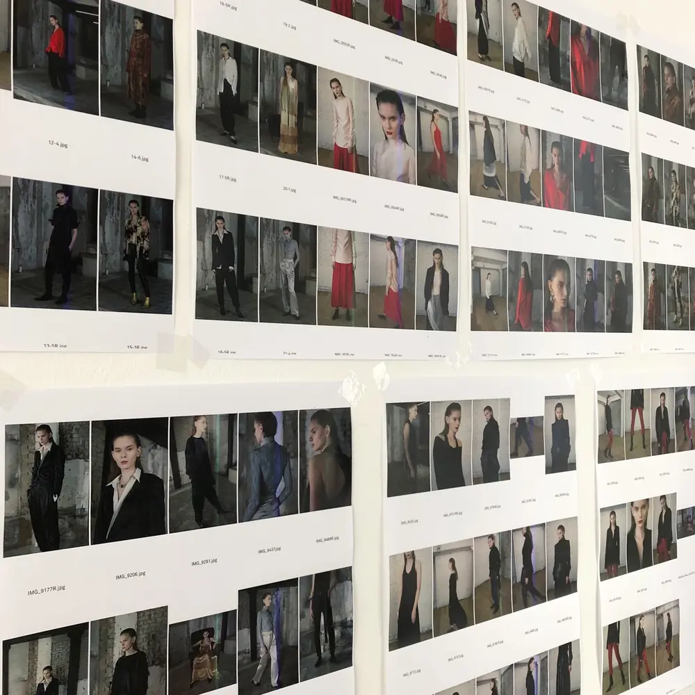
Songe Creux

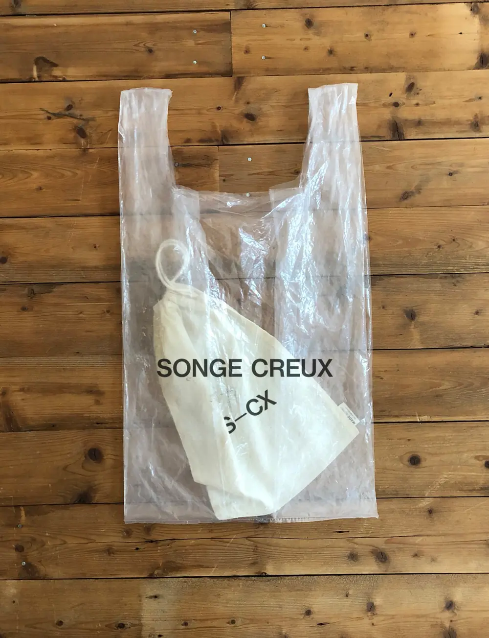
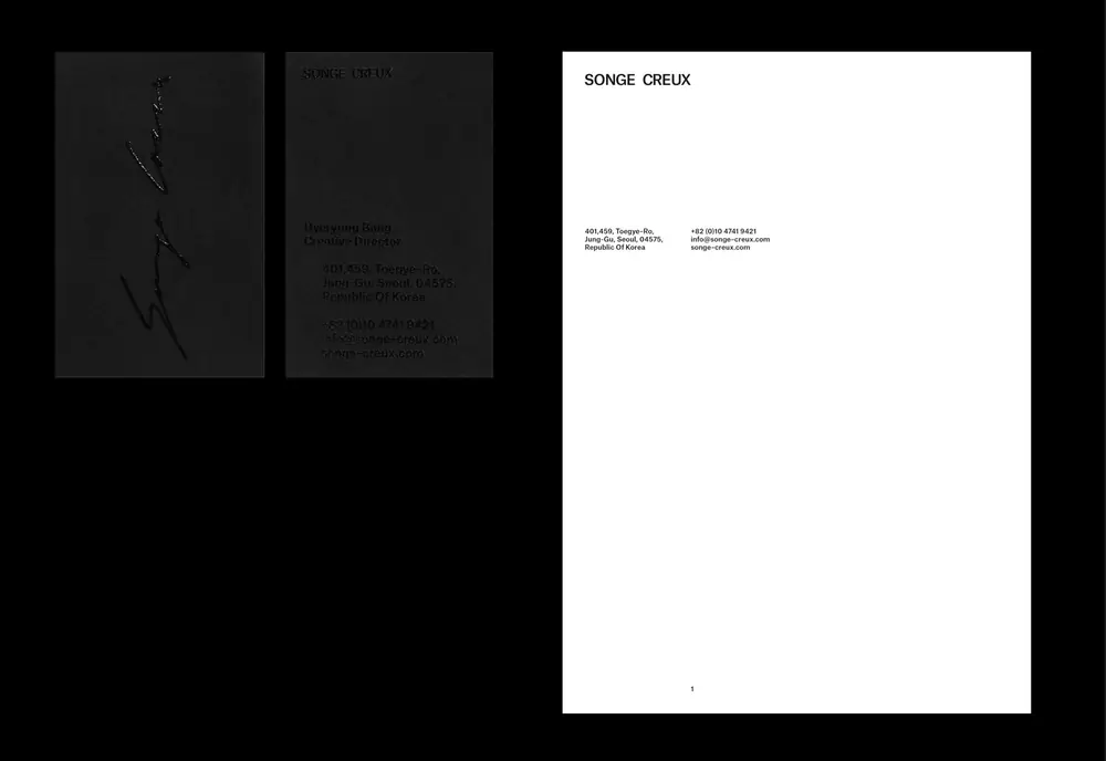
Lookbooks and identity for a fashion label, in black, white and red.

Lookbook · Identity · 2019–2022
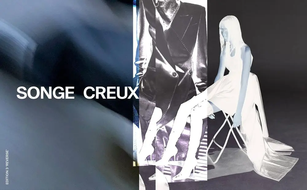
Songe Creux lookbook and identity, image 1
Songe Creux lookbook and identity, image 2
Songe Creux lookbook and identity, image 3
Songe Creux lookbook and identity, image 4
Songe Creux lookbook and identity, image 5
Songe Creux lookbook and identity, image 6
Songe Creux lookbook and identity, image 7
Songe Creux lookbook and identity, image 8
Songe Creux lookbook and identity, image 9
Songe Creux lookbook and identity, image 10
Songe Creux lookbook and identity, image 11

Samsung Fashion & Design Fund

Identity and website for a fund that supports young fashion designers.

Designer at SPIN · 2016–2017
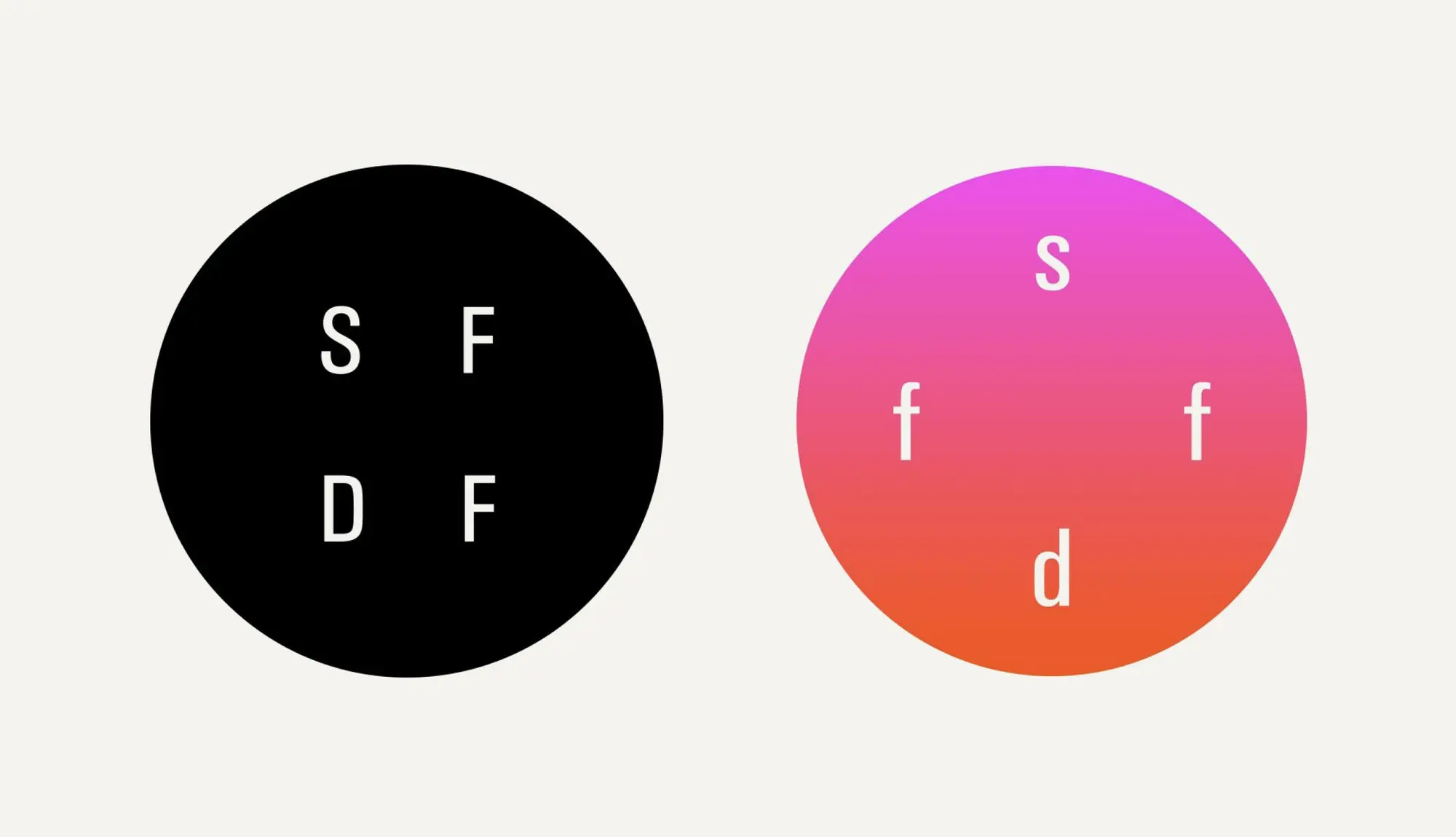
SFDF logo: S F D F in a black circle and in a pink-to-orange circle

Give me your bones

[MISSING: one sentence about the project]

Editorial · Print · [MISSING: year]
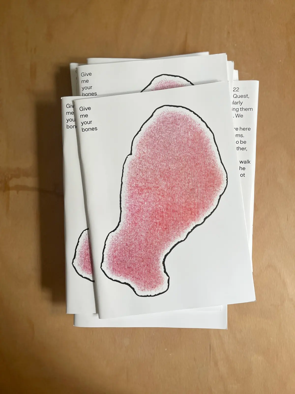
Stack of Give me your bones booklets with a red hand-drawn shape
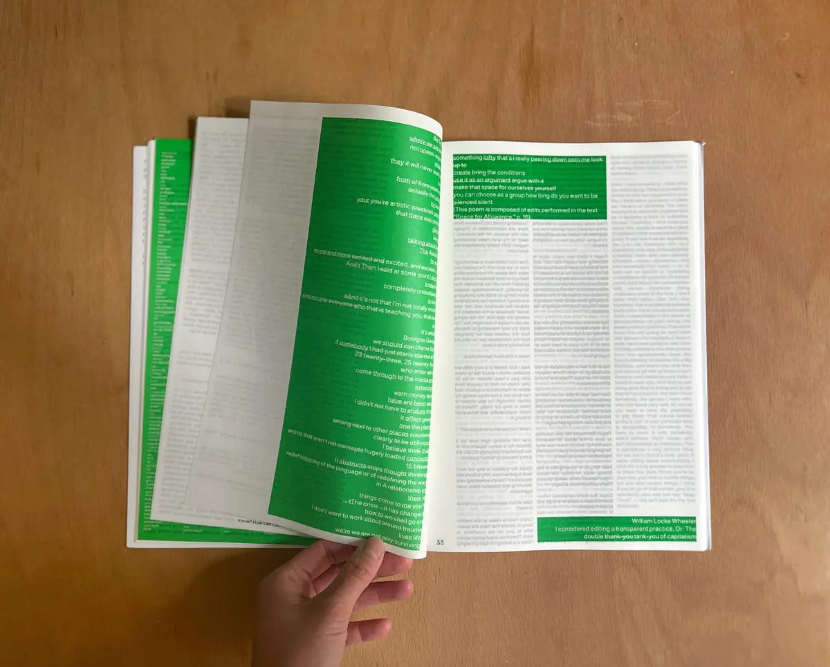
Hand holding open Give me your bones with green pages and dense text
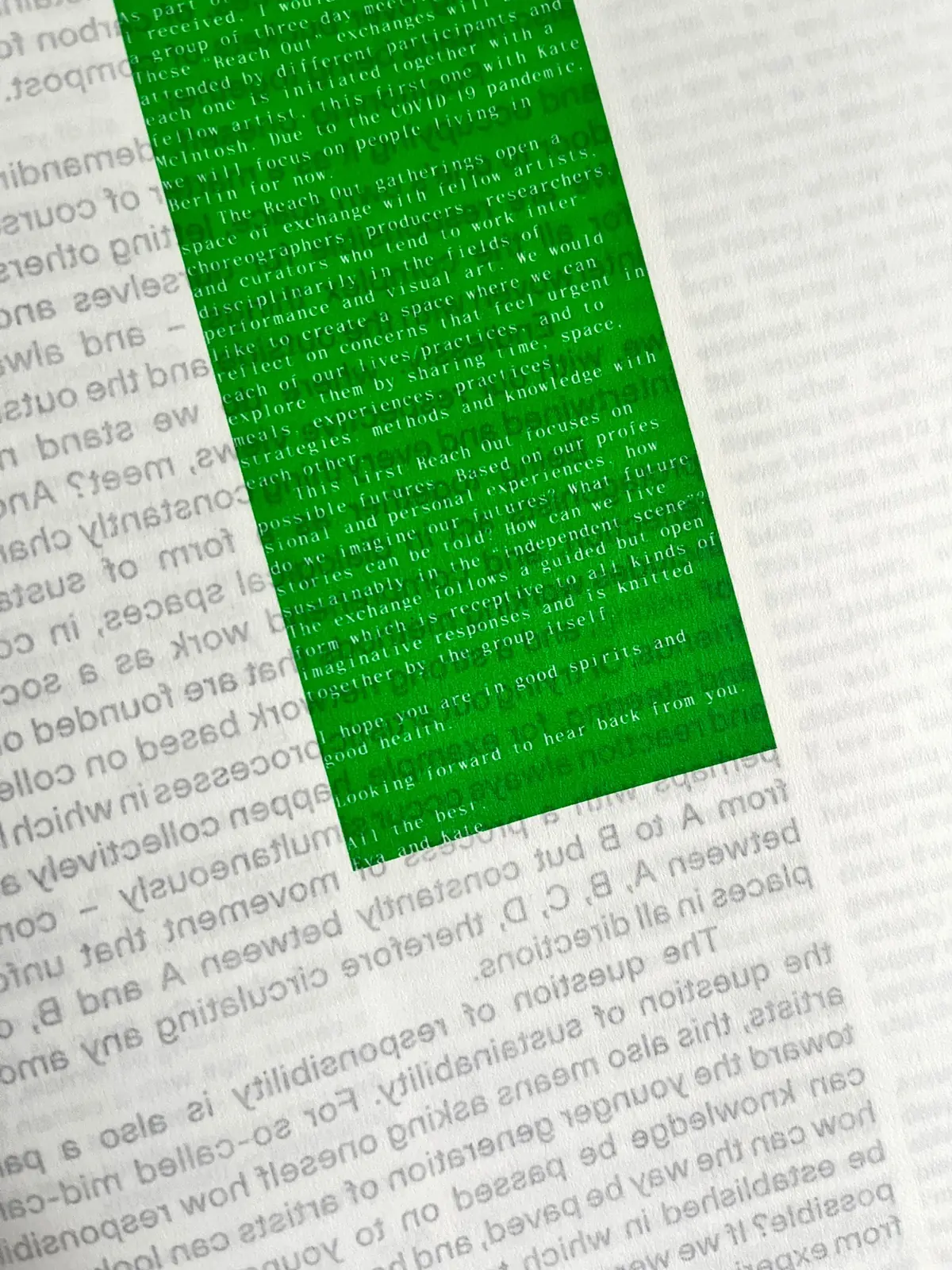
Close-up of a green printed block over small typeset text

Templates: two-up slider (Shanghai, Collect, Give me your bones), full bleed (Living Matters, BBC), three staggered per slide (Christofori, Songe Creux), footage (MAMA, SFDF). Images with a subpage link to it.

Visual · editorial
← Product

Unified design system for MDPI

Brand/System Designer · 2020–2024 · Print and digital

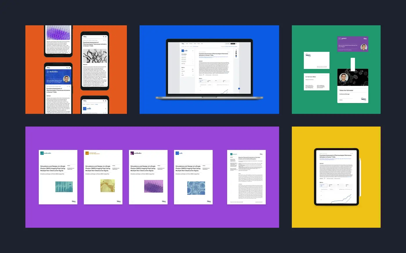
A unified design system for MDPI, a scientific publisher with eight research initiatives in 17 locations. What began as a brand identity in print grew into a four-year engagement and one system for print and digital. Today all eight initiatives build on one master template, and new ones start on it from day one.

A design system case study by Gaby Luong, Product Designer in Basel. More work on gabyluong.com
Problem25 years, 8 initiatives, 17 locations and no shared brand.
My roleBrand/System Designer, from print identity to digital design system.
What I didSurvey, halftone visual language, Figma foundations, tokens, 50+ components, rollout.
Result8 initiatives on one master template. New ones start on it from day one.
MDPI design system applied across web, mobile, layout and printed brand materials

Summary first: a recruiter who reads only this box has the whole story.

Why MDPI needed one brand across eight initiatives

MDPI had operated for 25 years without a brand. Each of its eight initiatives had developed its own look. There were no shared UI components, no colour system, no typography hierarchy and no style guide. The brand felt fragmented across print, digital and dozens of publications.

The raw material was a challenge too. MDPI’s main visual asset was scientific imagery, often at very low resolution and unusable at scale.
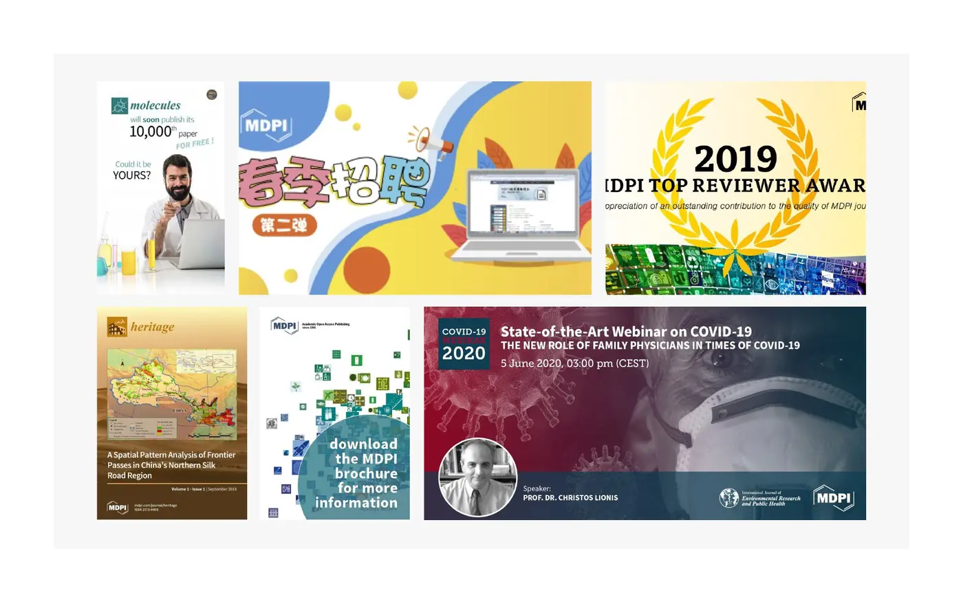
Earlier MDPI marketing materials, each in its own visual style before the unified brand
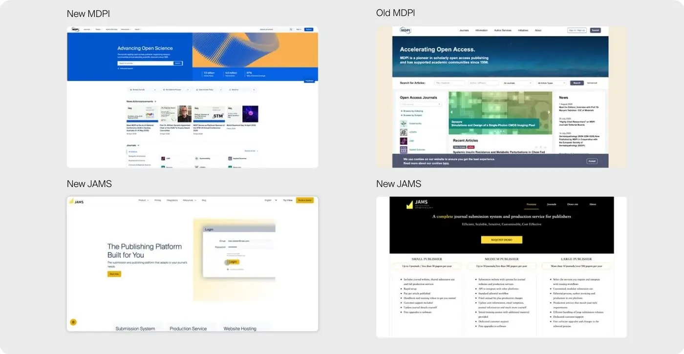
New and previous MDPI and JAMS websites shown side by side

Brand identity and design system, from freelance to in-house

Joined in 2020 as a freelancer from my practice in Amsterdam, approached by MDPI’s senior leadership, and continued in-house from 2022. Started with the brand identity in print, then moved on to the design system for digital products.

The core team was two people: me and a project sponsor from leadership. Worked closely with Graphic Design (print and video), Marketing, editorial designers, the project owners of each initiative and, later, a newly hired front-end team.
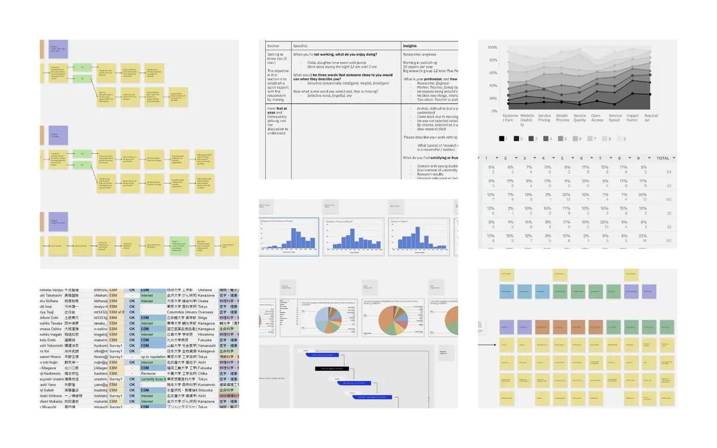
Design system process: from scientific imagery to Figma components

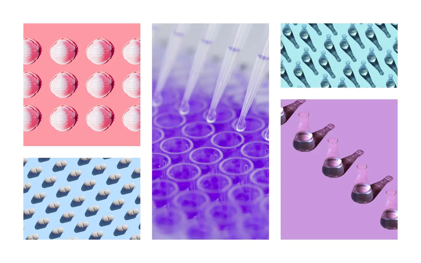
Visual languageExperimented with low-resolution scientific images until a pattern emerged: rendered as halftone, they became a texture that works the same in print and on screen.
TestingRan a perception survey linked from the MDPI website, with 80+ responses, alongside logo abstraction studies, typography readability tests and accessibility testing.
ApprovalPresented the findings to stakeholders across the company, including the founder. MDPI approved a consistent brand for the first time.
BuildingBuilt the foundations in Figma first: typography, iconography, colour and grid. Layered halftone component sets on top, backed by design tokens, with master templates each initiative extends.
RolloutMDPI Books, Scilit and JAMS adopted it first, in print and then digital. One regional team kept its own materials for six months; repeated conversations, not enforcement, brought them in within a year.
Perception survey results and research boards from the MDPI brand study
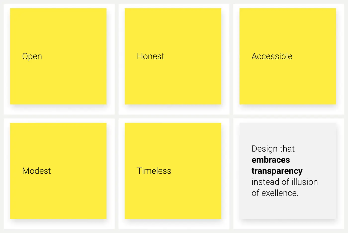
Brand attribute cards: open, honest, accessible, modest, timeless and a design principle
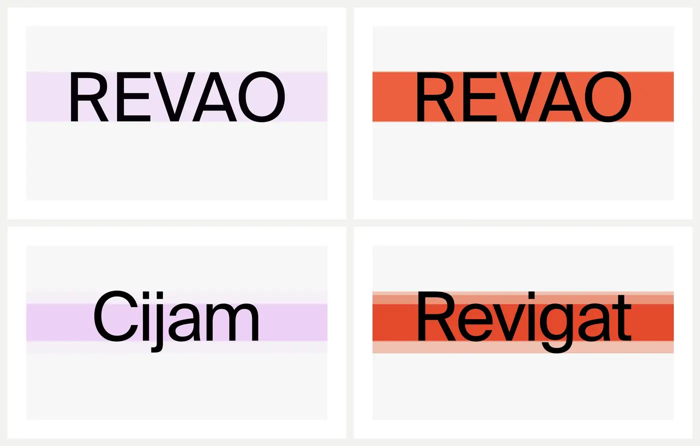
Typography readability tests using invented words set in Suisse Int’l
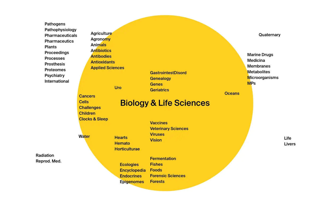
Map of MDPI journals grouped by subject, used to structure the initiatives
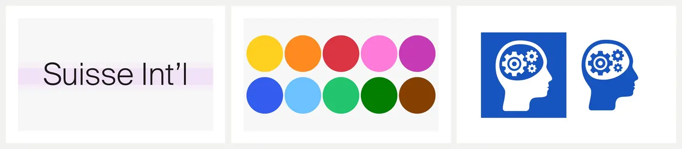
Design system foundations: Suisse Int’l typeface, colour palette and initiative icons

Survey, brand attributes, readability tests, subject map and foundations.

Craft lives here: annotate why this typeface, these colours, this grid.

Key decision: turning low-resolution imagery into the identity

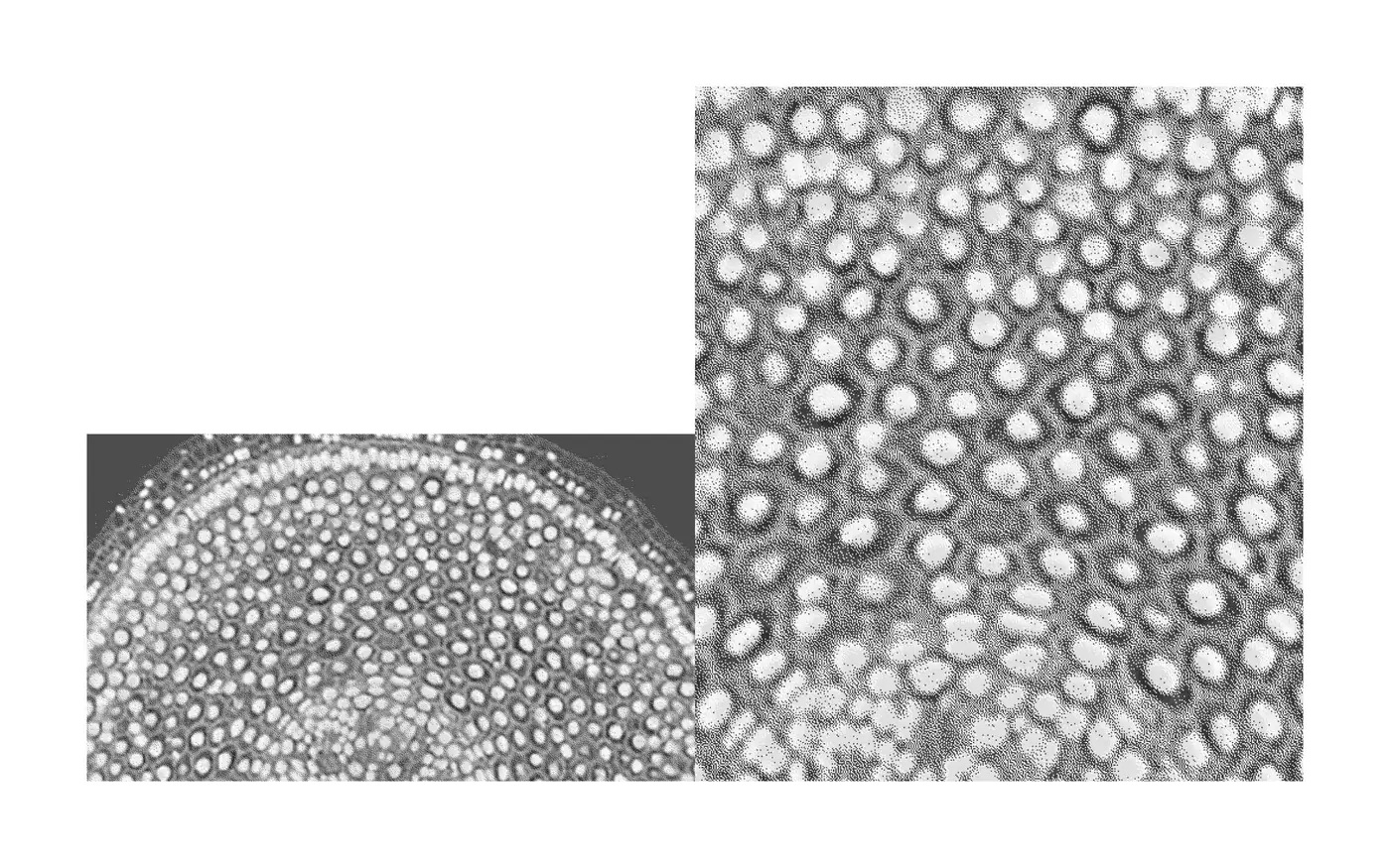
MDPI’s main visual material was low-resolution scientific imagery, unusable at scale. Instead of working around it, the system uses it as the source of the identity. Rendered as halftone, MDPI’s own research became an abstract visual signature that works the same on a printed cover and in a web component.

Because the identity comes from what MDPI publishes, it feels specific to the company. Every initiative can draw on the same material without diluting the brand. That consistency made one unified design system across all eight initiatives possible.
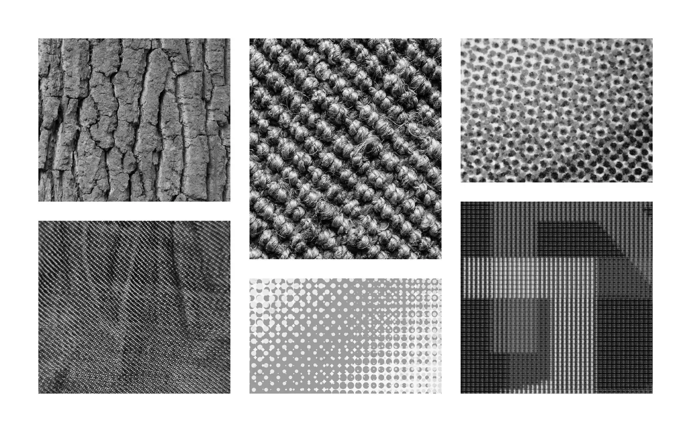
Low-resolution scientific images in greyscale before the halftone treatment
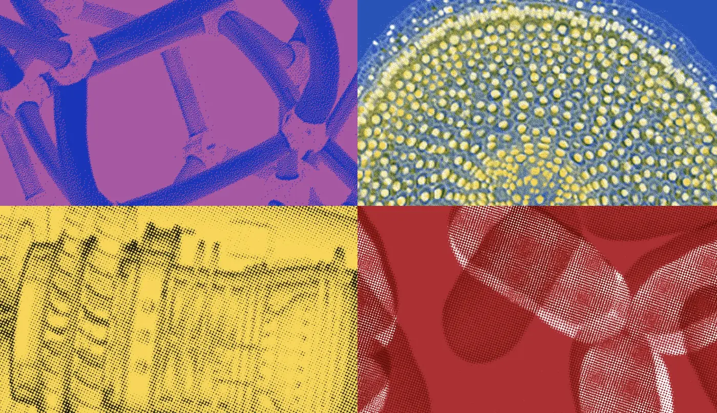
Scientific imagery rendered as a halftone pattern for the MDPI visual language
Halftone patterns in colour, used across print and digital brand materials

Raw image → halftone → colour.

Results: one design system for eight initiatives

8initiatives in 17 locations, each tied to one master template
50+components; all legacy components replaced
Day onenew initiatives start on the system, not from scratch
  • Only each initiative’s own colour was kept from the old components.
  • Marketing and leadership described the brand as calmer and more structured. Teams gained a clearer sense of what they were building toward.
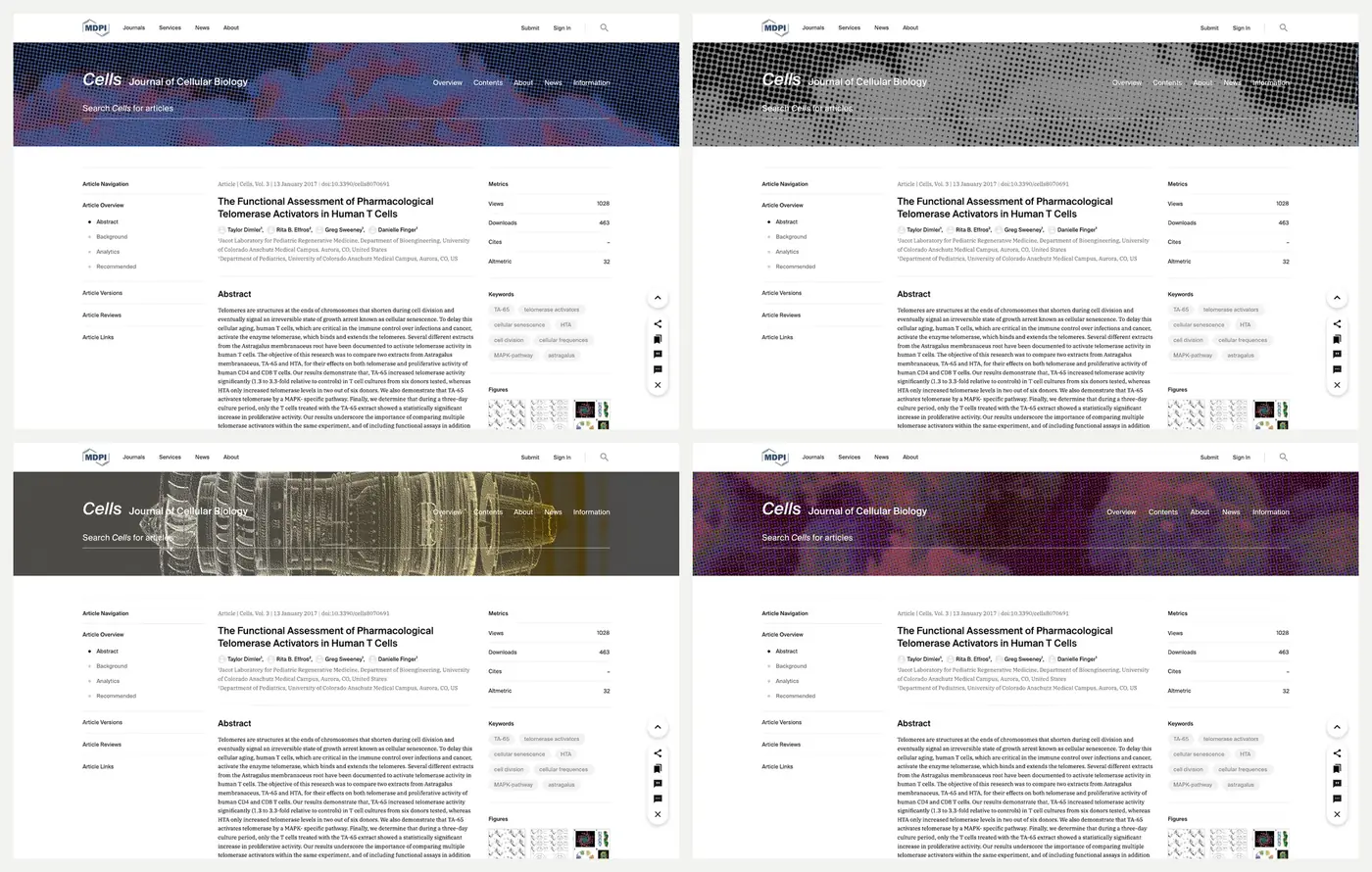
Four journal page headers built from one master template with different imagery

Building a design system across teams? Get in touch.

Case study · Summary first
← Product

MDPI Books: publishing platform redesign

Product Designer · 2023–2024 · 14 months to launch

A publishing platform redesign for MDPI Books, the open access book platform of a scientific publishing house. The redesign made books easier to find and easier to publish. Within six months of launch, traffic tripled and landing-page drop-off fell from 83% to 22%. Books moved from MDPI’s 4th to its 2nd revenue-generating product.

A UX case study by Gaby Luong, Product Designer in Basel. More work on gabyluong.com
ProblemNo design role, a buggy Book Builder and readers who could not find books.
My roleProduct Designer, end to end, with product management at the start.
What I didInterviews, workshop, wireframes, prototype and weekly work with front-end.
Result3× traffic, landing-page drop-off 83% → 22%, 4th → 2nd revenue product.
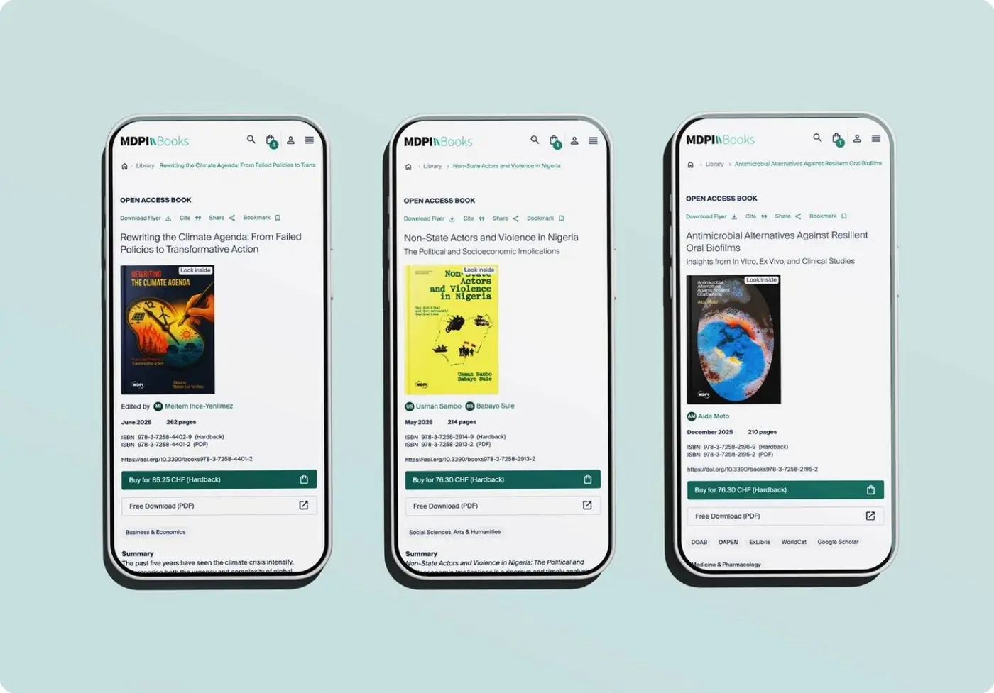
Three mobile screens of the redesigned MDPI Books publishing platform showing book pages

Summary first: a recruiter who reads only this box has the whole story.

Why readers could not find books on MDPI Books

The Books team had no dedicated design or UX role. The team took on the redesign alongside daily work and expected a visual refresh. The Book Builder, the flow authors use to compile books, was full of bugs and had no tracking. Avoidable support requests took time away from building.

User interviews showed the problem went deeper than visuals:

7 of 7couldn’t find the books they needed
5 of 7didn’t know what resources existed
4 of 7had no time to browse

Baseline: 83% landing-page drop-off · 60.51% site-wide bounce rate · 0.87% conversion rate · 3.38 minutes on site
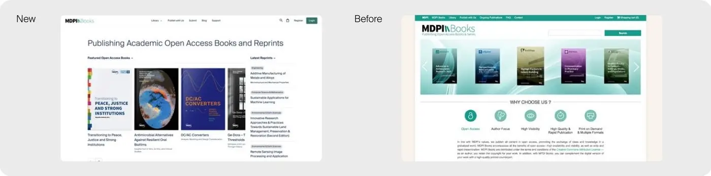
New MDPI Books homepage beside the previous version of the site

Product design and product management, end to end

Product Designer on the project from first research to launch: UX research, the component library, prototyping, stakeholder management and handoff to development.

With no fixed deadline and little spare capacity on the team, I also took on product management at the start: setting the scope, running alignment and keeping the work moving. The wireframe stage had no front-end developers. Two joined for the prototype stage, hired for this redesign.
UX research process for MDPI Books

ResearchCollected the team’s assumptions, then ran 7 moderated interviews with academics and researchers to test them.
AlignmentThe findings gave the team one hypothesis: a more visual, better-structured site helps readers find books. A cross-country stakeholder workshop confirmed it.
Wireframes to prototypeRestructured the information architecture, designed discovery pages around what users could not find, rebuilt the Book Builder flow and simplified payment. Tested the high-fidelity prototype with colleagues outside the project, as the budget did not allow a second external round.
Building togetherMoved my desk to the front-end team, followed their builds in weekly streams and ran weekly sessions so design and code stayed aligned. Set up the tracking the Book Builder had been missing.
LaunchLaunched with SEO support from Marketing.
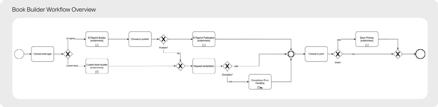
Book Builder workflow diagram showing how authors compile a book from a special issue
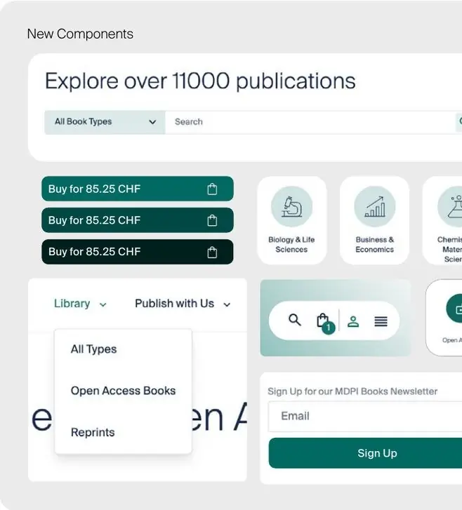
New interface components: search field, purchase buttons, subject icons and newsletter sign-up
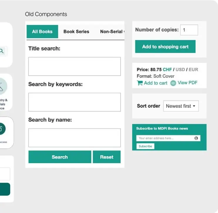
Previous interface components: separate search forms, shopping cart fields and a subscription box
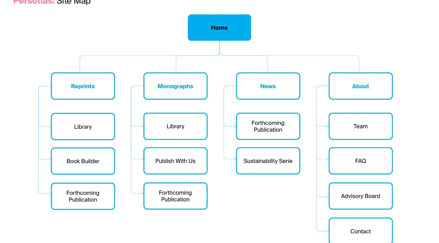
Site map of the new MDPI Books information architecture with its main sections
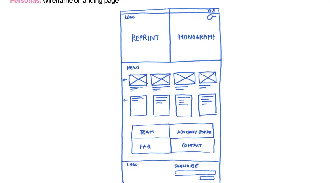
Hand-drawn wireframe sketch of the MDPI Books landing page with reprints and monographs

Book Builder workflow, new and old components, site map and first sketch.

Craft lives here: new vs old components, with a short note on why each changed.

Key decision: from visual refresh to strategic redesign

The team asked for a new look. The interviews showed three deeper problems: books were hard to find, people did not know what existed, and the publishing flow did not work. A visual refresh would have made these problems look better without solving them.

The research reframed the work as a publishing platform redesign around structure and flows: how readers find books, and how authors get through the Book Builder. Because the new direction came from the team’s own assumptions, tested with real users, the team supported it. That shared direction carried the project through 14 months to launch.
Results after launch: traffic, drop-off and revenue

3×traffic within 6 months of launch
83% → 22%landing-page drop-off
4th → 2ndrevenue-generating product at MDPI
  • Fewer email complaints reached the Books team after the relaunch.
  • Tracking now sits behind the Book Builder, so the team can measure what it could not before.
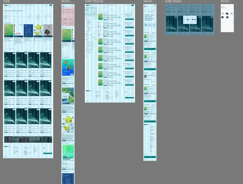
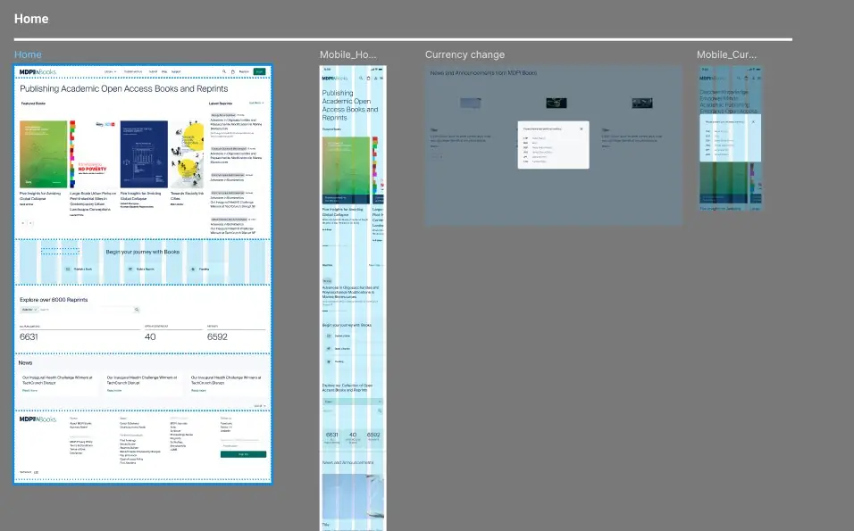
Final MDPI Books homepage layout on desktop and mobile, shown on the layout grid
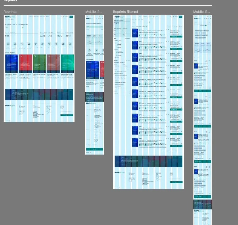
Reprints overview and filtered list pages on desktop and mobile
Open access books overview, filtered results and share dialogue on desktop and mobile
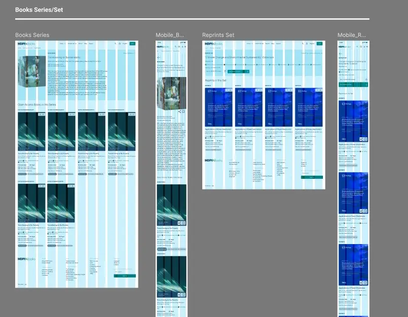
Book series and reprint set pages on desktop and mobile

Final layouts on a 12-column grid: homepage, reprints, open access books and series.

Working on a complex platform? Get in touch.

Case study · Summary first
← Product

MDPI User Hub: UX research case study

Lead UX Research · 2025 · 4 months

A UX research case study for MDPI’s User Hub, a planned dashboard for all user accounts. Satisfaction scores looked healthy, yet usage data showed people leaving right after they logged in. The research explained the gap and turned it into a design direction for the dashboard.

By Gaby Luong, Product Designer in Basel. More work on gabyluong.com
ProblemAn NPS around 50, yet 1 in 4 visits ended right after login.
My roleLead UX Research, with a Product Owner and a developer.
What I didMetrics → customer journey → 7 interviews → matrix → wireframes.
Result6 validated patterns and a direction the next phase builds on.
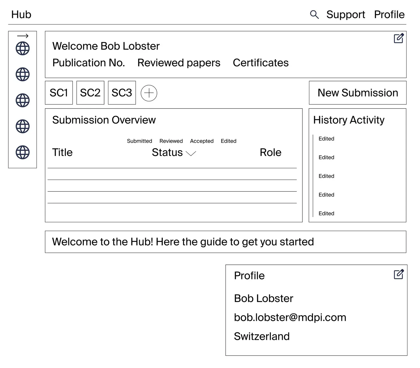
Low-fidelity wireframe of the User Hub dashboard with submission overview and activity

Summary first: a recruiter who reads only this box has the whole story.

Why users left MDPI’s submission system after login

MDPI wanted to unify user accounts in one dashboard. The work started with Susy, the submission system that generates the most revenue and where every user has an account.

Satisfaction looked reassuring: Marketing’s 2024 author survey, with around 37,000 responses, showed an NPS of about 50, and 95% rated their experience good or excellent. Usage data from the second half of 2024 told a different story:

1 in 4visits ended at the second page, right after login
1 in 5visits to the submission flow ended in a submission in the same session
Over halfof those who started left at the first submission step

No one owned the full picture across Editorial, Support and Product, so no one could explain the gap.
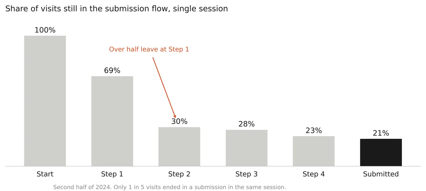
Bar chart: share of visits still in the submission flow at each step

Lead UX researcher, with a Product Owner and a developer

Ran the research from the first questions to the first wireframes, together with the Product Owner and a developer. The Product Owner helped recruit participants.

The Editorial and Support teams, who work in Susy daily and handle users’ questions and complaints, contributed their knowledge as input.

UX research process: customer journey, user interviews and synthesis

QuestionsDefined what we needed to know: who the users are, what they try to do, what brings them to Susy, and whether they use their account beyond one submission.
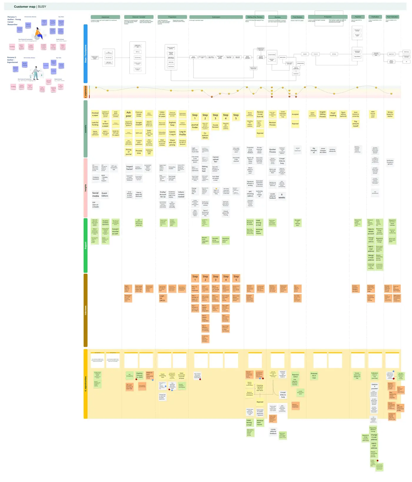
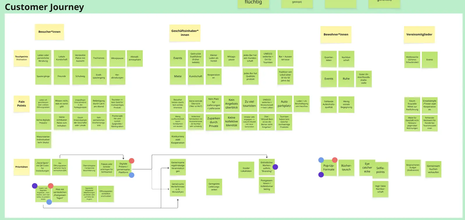
Customer journeyCombined metrics, survey data and team insights into a journey map with two personas. The early-career persona came from internal insights.
InterviewsRefined the questions in three rounds with colleagues in Basel, then ran 7 moderated interviews with authors, reviewers, guest editors and editors.
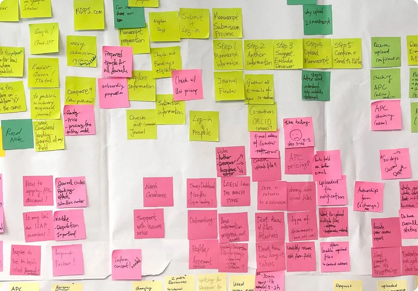
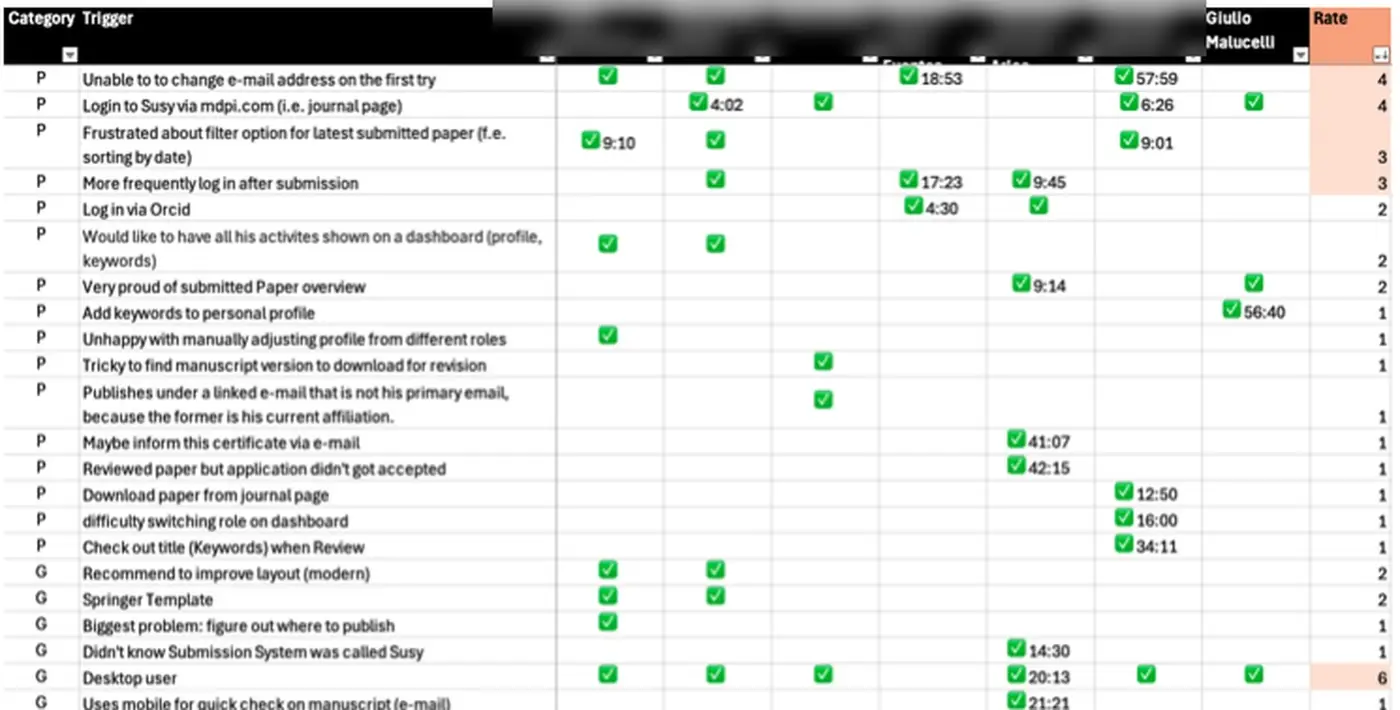
SynthesisClustered findings on an affinity map with 200+ notes and ranked pain points in a matrix. Top two, each raised by 4 of 7: changing an email address, and logging in from a journal page.
WireframesTurned the findings into low-fidelity wireframes and reviewed them with stakeholders.

Six patterns emerged:

  • Users are goal-driven and want to submit in 30–60 minutes.
  • Mixed terms and a dated look cause disorientation.
  • Repetitive manual fields reduce satisfaction.
  • Login and navigation friction hurts first impressions.
  • Users want one role-aware dashboard.
  • Optional features like cover letters are mostly ignored.
Customer journey map for Susy with two personas, touchpoints and emotion curve
Affinity map with over 200 sticky notes from the user interview analysis
Pain point matrix ranking issues by how many of seven participants raised them

Customer journey, affinity map and pain point matrix (participant names removed).

Key decision: start with one product and one dashboard

Unifying accounts across every MDPI product at once would have been a large change that was hard to approve. Instead, the work started with Susy, the product with the most revenue and the one every user has an account for. We proposed a single dashboard as the first step, without major changes to the submission system itself.

A dashboard was concrete and low-risk, which made it easy for stakeholders to say yes. That support opened the door to look deeper: into the metrics, the NPS and, through the customer journey, the evidence for why users left.

Results: six validated patterns and a dashboard direction

7moderated interviews across four user roles
6validated behaviour patterns
4wireframed areas, each tied to a finding

The UX research reframed User Hub from a UI refresh into an evidence-based redesign. For the first time, MDPI could explain why satisfaction scores and usage data disagreed: the survey measured the overall publishing experience, while the interviews showed where users lost their way in the platform.

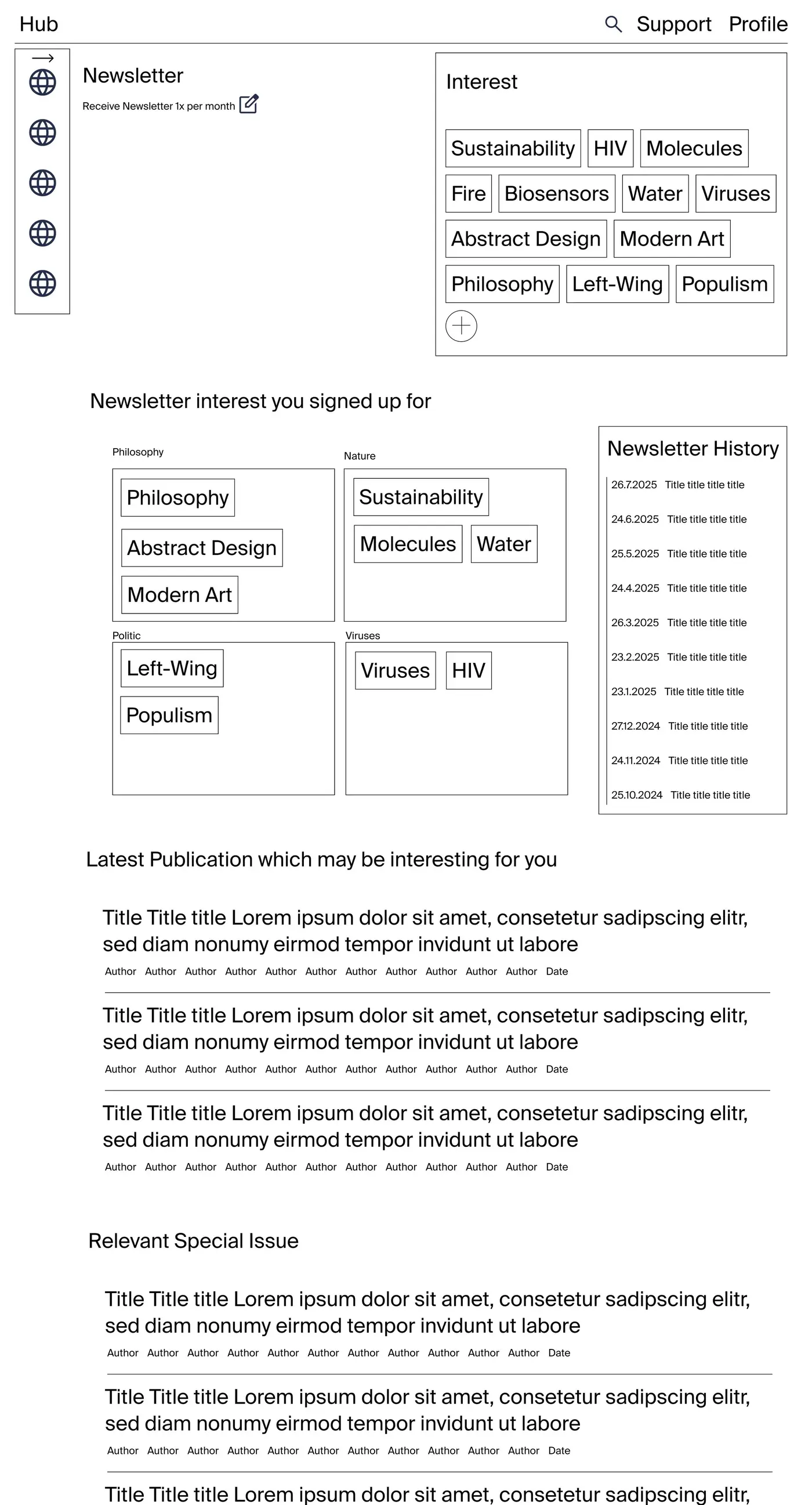
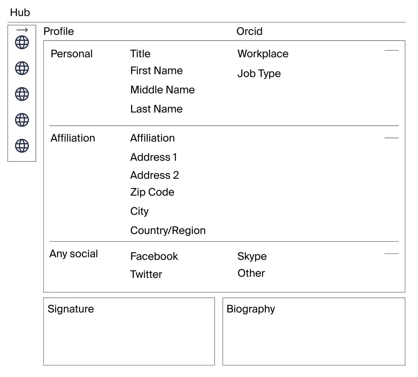
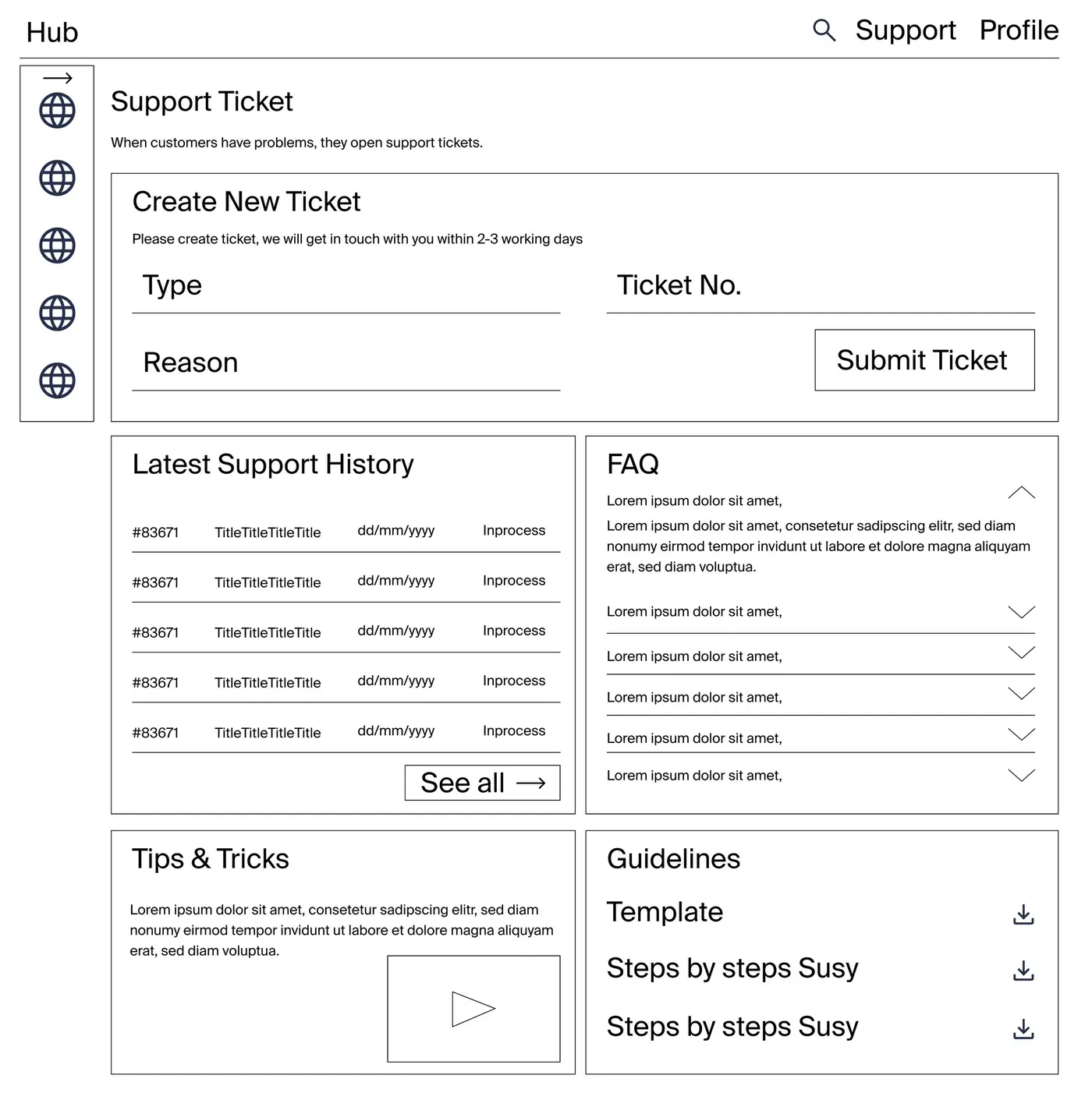
The wireframes cover a dashboard with submissions and activity, a simpler profile, self-service support and personalised newsletter interests. My part ended after the research and first wireframes, when I left MDPI. The next phase builds on this direction.
User Hub dashboard wireframe with submissions, activity history and profile summary
Low-fidelity wireframe of the User Hub profile and account section
Low-fidelity wireframe of the self-service support area with tickets and FAQ
Low-fidelity wireframe of personalised newsletter interests and recommended publications

Need research that turns data into direction? Get in touch.

Case study · Summary first
← Product

Altstadt Bern: UX research beyond the screen

UX Researcher · 2025 · CAS Usability & User Experience, FHNW

A UX research case study on the lower Old Town of Bern, a UNESCO World Heritage site that many people pass through without stopping. Instead of a classic urban study, the team talked to the people who use the space: visitors, residents and shop owners. The offering is there, but hard to see.

By Gaby Luong, Product Designer in Basel. More work on gabyluong.com

ProblemSmall shops in the lower Old Town face few visitors and rising vacancies.
My roleUX Researcher in a team of three; ran the second interview round.
What I didObservation, 15 street interviews, in-depth interviews, customer journey.
ResultThree priority actions and a phased plan for the local association.
Map of the lower Old Town of Bern with numbered research findings per lane

Why the lower Old Town of Bern attracts fewer visitors

The lower Old Town is home to small, independent shops, studios, galleries and craft businesses. Tourists pass through, but few stop. Shop turnover and empty retail space had grown in recent months.

The question: which simple measures could make the area more attractive, while respecting the people who live there?
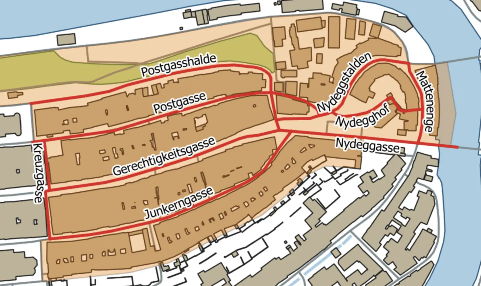
Map of the lanes studied: Postgasse, Gerechtigkeitsgasse, Junkerngasse, Nydegg and Matte

UX research in a team of three

A case study for the CAS in Usability and User Experience at FHNW, in a team of three with a supervising lecturer. Working mostly in digital design, I wanted to understand human behaviour beyond screens.

My part was the second round of street interviews. It validated the findings from the first round and followed up on the open questions it had raised.

UX research process: observation, street interviews and a customer journey

QuestionsNarrowed the core question to: which measures can make the lower Old Town more attractive? Two hypotheses followed: experience-based wayfinding and regular events.
User groupsMapped all user groups, then focused on visitors and businesses, with residents alongside.
ObservationObserved places and people in two periods, February to March and May to July 2025, to see the area across seasons.
Street interviewsRan guerrilla interviews in two rounds: 6 open conversations first, then 9 with a structured question grid, on the same weekday and time.
In-depth interviewsTalked with the president of the local association and two shop owners.
Customer journeyMapped touchpoints and pain points per user group, then prioritised measures by dot voting.

What the research showed:

  • Visitors like the small shops and personal advice, but find closed shops and unclear opening hours.
  • People walk through the lanes but rarely stop. A shop that already looks busy draws people in.
  • Shop owners lack foot traffic and visibility, and mostly work alone rather than together.
  • Residents want calm, neighbourhood life and less car traffic.

“I’ve lived here my whole life, and I still don’t understand why no one comes to Postgasse.” Resident, street interview
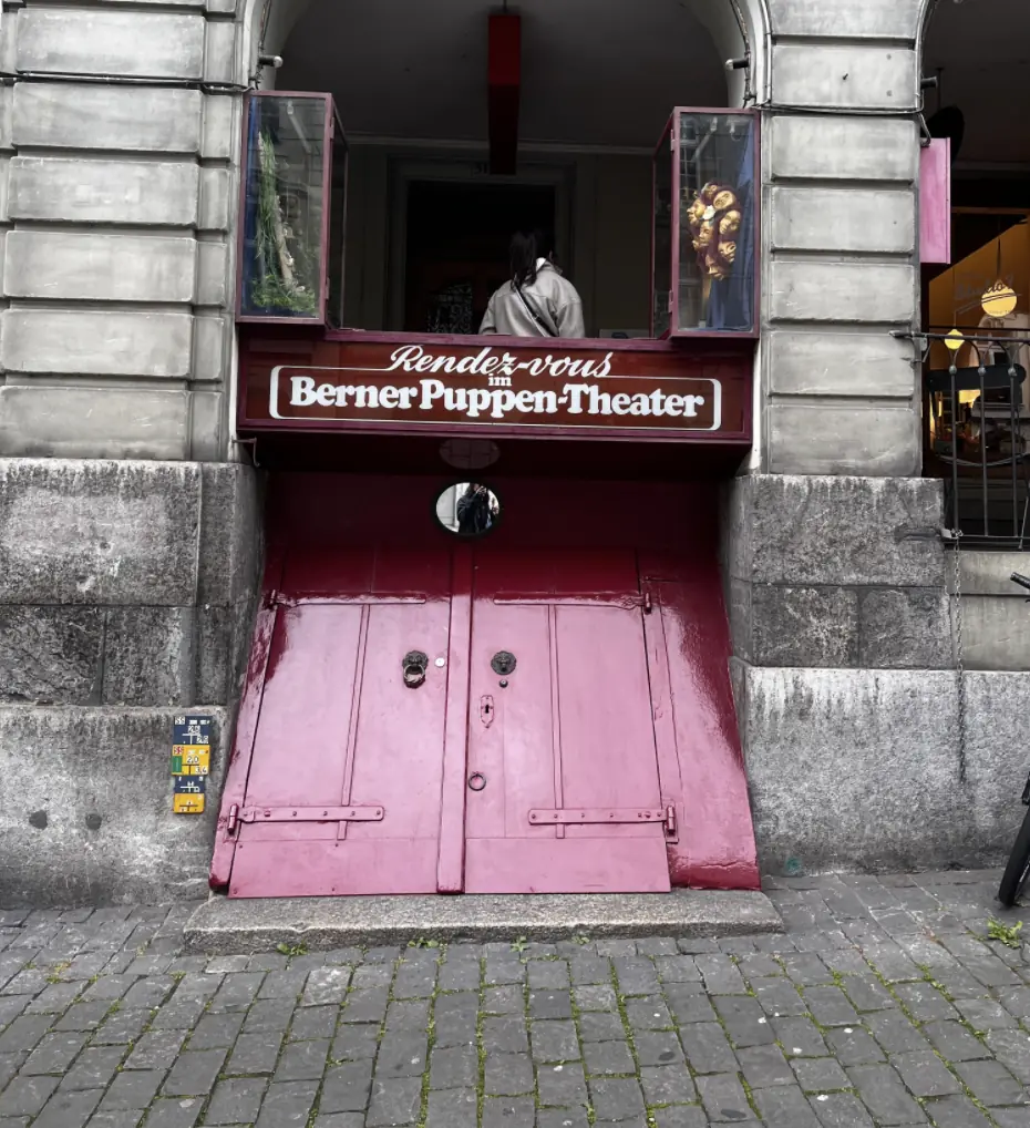
Pink door of the Berner Puppentheater in an arcade
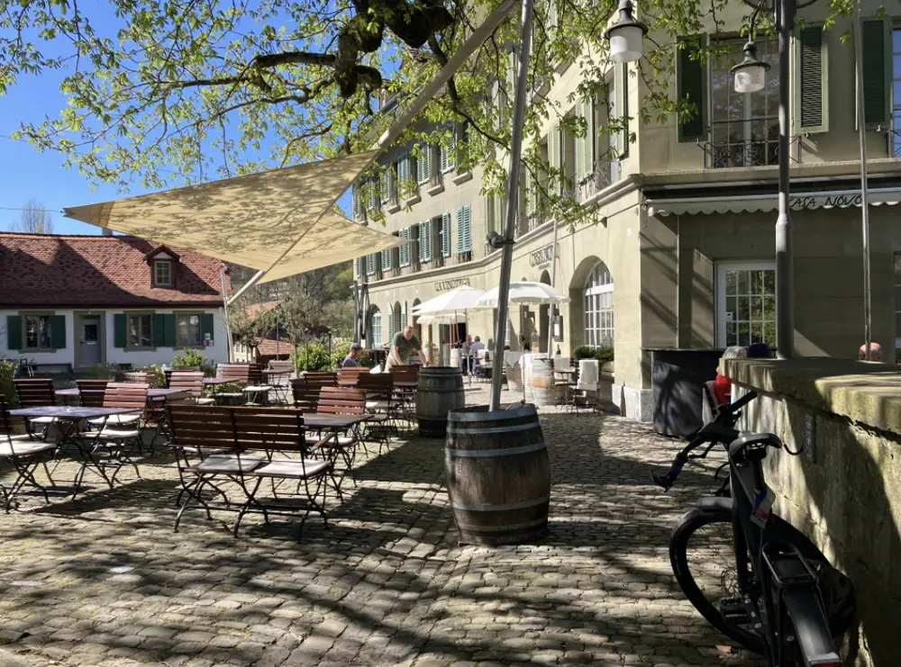
Restaurant terrace under a sail in the lower Old Town
Customer journey map with touchpoints and pain points per user group

Key decision: listening to people before planning from the map

Urban planning usually starts with plans, standards and building measures. This study started by listening. Talking to visitors, residents and shop owners surfaced details a spatial analysis would likely miss: unclear opening hours, the rhythm of events and the need to be seen together.

The first six interviews already showed the main barriers. The second round confirmed them.

Results: three priorities for the lower Old Town

3priority actions agreed by the team
15street interviews in two rounds
2hypotheses supported by the interviews
  • A fixed calendar of regular events, such as every first and third Saturday.
  • A shared digital presence with an interactive map of shops, opening hours and events.
  • A pop-up system that opens empty shops for temporary use.

The plan starts with a test phase together with the local association in 2026–2027, followed by shared branding and digital tools. The study could not test the measures: in a city, prototypes need time, permits and many people. With more time, the next step would be a digital prototype of the event calendar and map.
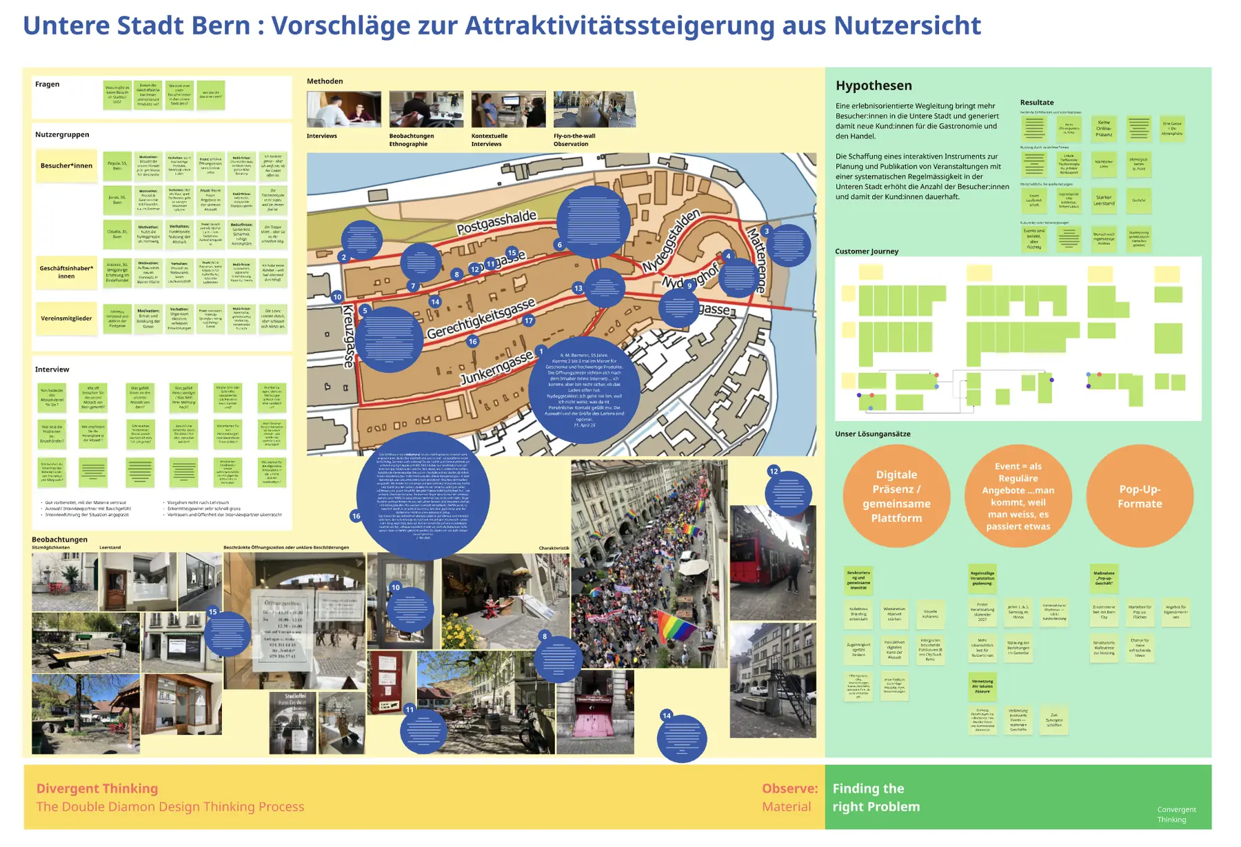
Research board with hypotheses, map, photos and prioritised measures

Researching how people use a space or service? Get in touch.

Case study · Summary first
← Visual

Shanghai Biennale 2018: identity and catalogue

Art Director & Graphic Designer (freelance, with thonik) · 2018 · Identity, Catalogue, Logo

Exhibition identity and catalogue design for the 12th Shanghai Biennale at Power Station of Art. I worked on it as a freelancer with thonik in Amsterdam, including a trip to Shanghai to align with the local team and the exhibiting artists. The logo is built from the biennale’s own typeface: a double-crossing mark set against two circles, exploring the tension between human-driven and computational design. The identity carried through the catalogue, street banners and the museum building.

By Gaby Luong, Product Designer in Basel. More work on gabyluong.com

Biennale identity on large banners at the entrance of Power Station of Art
Shanghai Biennale 2018 catalogue cover in green with magenta lettering
Green Shanghai Biennale street banner on a lamppost
Catalogue spread with artwork photography
Catalogue spread with archive images and typeset texts

Same structure as the product case studies: left-aligned title, one text block, uncropped images, max 3 per row.

Visual project page
← Visual

Living Matters: risograph poster series

Graphic Designer · 2020–2021 · Typography, Editorial, Print production

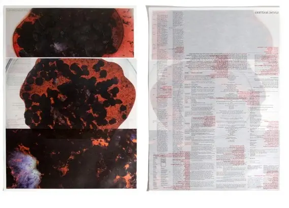
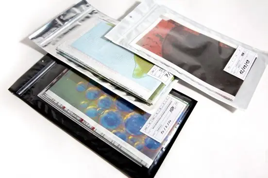
A risograph poster series for Berlin artist Eva Keller and her scientific, exploratory performance work. Her research imagery became one typographic system across four posters: Medium, Material, Apparatus and Experiments. Printed in Amsterdam on thin paper, so text and imagery bleed through from front to back.

By Gaby Luong, Product Designer in Basel. More work on gabyluong.com
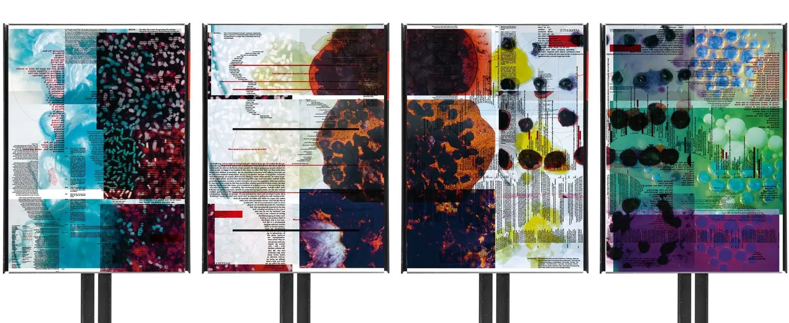
Four Living Matters risograph posters on stands
Two Living Matters posters with dense typography and red accents
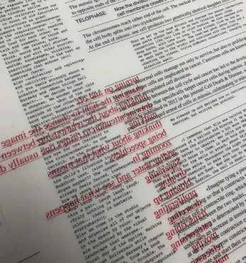
Thin risograph paper with text showing through
Poster with dark scientific imagery beside fine typeset text
Living Matters posters packed in clear sleeves

Same structure as the product case studies: left-aligned title, one text block, uncropped images, max 3 per row.

Visual project page
← Visual

MAMA: film title design and poster

Art Director · 2022 · Film titles, Poster, Motion

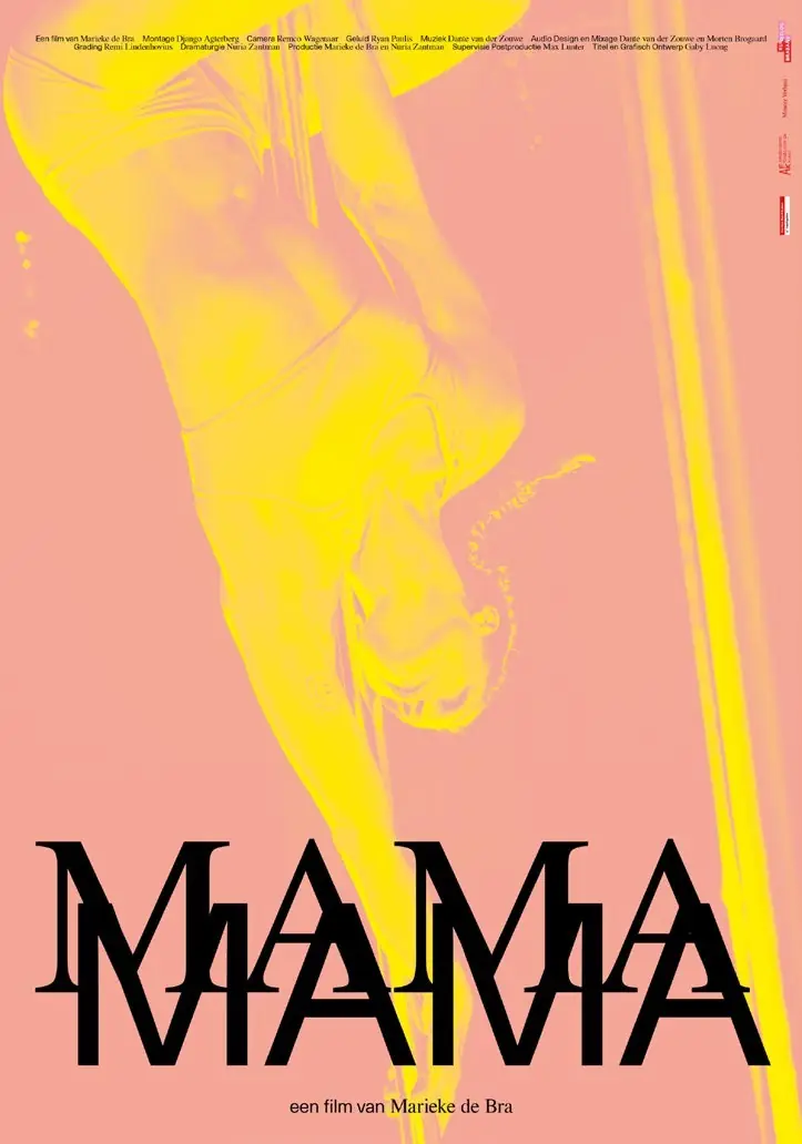
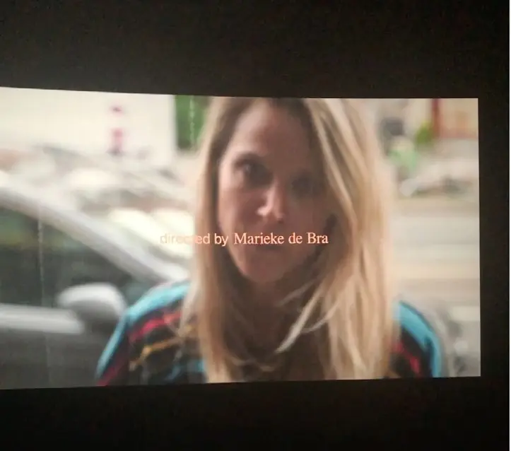
Film title design and poster for MAMA, a documentary by Marieke de Bra. The film follows her path through abandonment anxiety, months of pole dance competition training and therapy with her own mother. The letters move the way she does: overlapping, shifting, then holding still, caught between control and vulnerability. The opening was shown at the Eye Museum in Amsterdam.

By Gaby Luong, Product Designer in Basel. More work on gabyluong.com
MAMA documentary poster with layered title typography in yellow and pink
Opening credits of MAMA projected during a screening

Same structure as the product case studies: left-aligned title, one text block, uncropped images, max 3 per row.

Visual project page